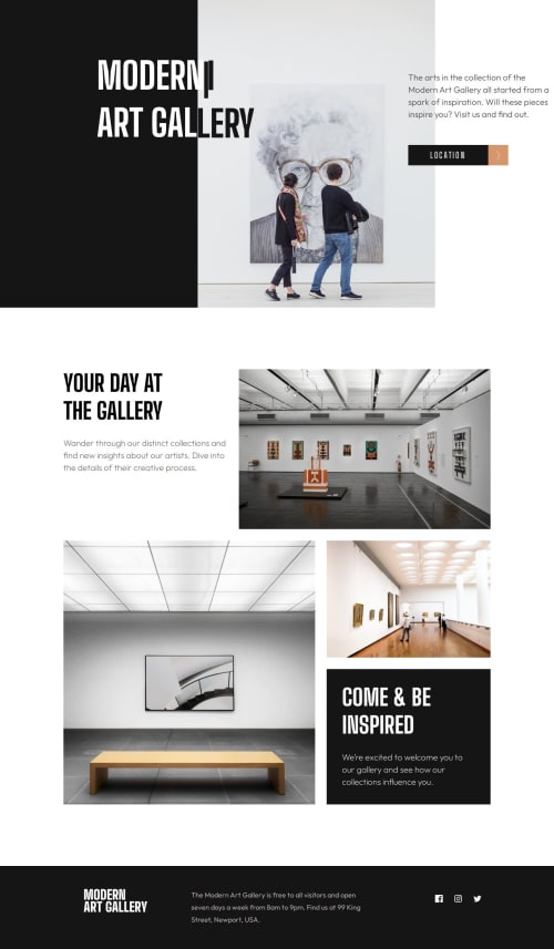
Art Gallery w/ Css Grid and Flexbox Layout

Solution retrospective
This project took a lot longer than I anticipated (a recurring scenario with me), and that was due to scaling down the design while maintaining responsiveness, i.e., font size, container width, and height, and adjusting the CSS grid and flexbox layouts throughout the viewports.
I keep mentioning that I'm going to use clamp(), but I never do. However, I did use it for the 'Our Location' title. It worked great! I need to start following through.
I did follow through with more semantics and using fewer <div>, and also, more comments within my code for better readability .
What challenges did you encounter, and how did you overcome them?Initially, figuring out how to make the header's background image responsive was challenging. The image wasn’t scaling properly across different screen sizes, causing layout issues. After experimenting with background-size values (cover vs. contain), adjusting container heights, and analyzing how the image behaved on different devices, I learned to set background-position: center; and choose the right background-size to ensure the image filled the space accordingly without overflowing or losing quality.
This process involved trial and error—testing different CSS properties, inspecting results in browser dev tools, and fine-tuning your sizes and positions until the header looked perfect on all screens.
What specific areas of your project would you like help with?Any tips and advice are always welcome.
Happy coding and blessings to all!
Please log in to post a comment
Log in with GitHubCommunity feedback
No feedback yet. Be the first to give feedback on Rodrigo's solution.
Join our Discord community
Join thousands of Frontend Mentor community members taking the challenges, sharing resources, helping each other, and chatting about all things front-end!
Join our Discord