Not Found
Not Found
Not Found
Not Found
Not Found
Not Found
Not Found
Not Found
Not Found
Not Found
Not Found
Not Found
Not Found
Not Found
Not Found
Not Found
Not Found
Not Found
Not Found
Not Found

Submitted

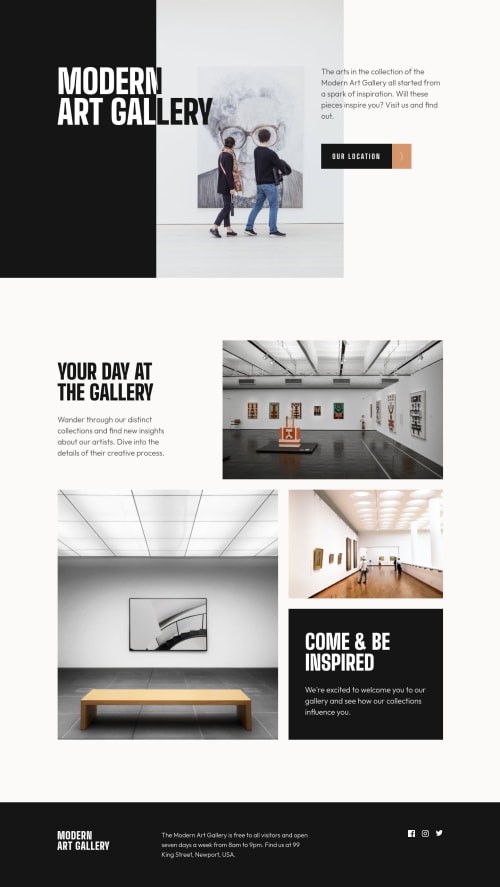
Art gallery Website | API | Leaflet.js | HTML | CSS | JS | Responsive

#accessibility
Arthur Roberts• 410

@arfarobs

Desktop design screenshot for the Art gallery website coding challenge

This is a solution for...

  • HTML
  • CSS
2junior
View challenge

Design comparison


SolutionDesign

Solution retrospective


This is the first multi-page site that I have done on Frontend mentor. This is also the first time I have used an API in my projects. I thought that the website itself wasn't very challenging. However, the API was a bit of a challenge for me. Any feedback would be greatly appreciated.

  • How's my JS? Especially the map implementation?

Community feedback

Vanza Setia• 27,855

@vanzasetia

Posted

Hello, Arthur! 👋

Congratulations on finishing this challenge! 🎉

Regarding your questions:

  • Yes, I recommend merging both CSS files into one. It's going to make it easy to maintain because with one CSS file all you need to card is just one CSS file. Right now, if you want to debug something, you need to keep in mind that you might need to change something too on the other file. Also, the site will get performance benefits because it only needs to download one CSS file for the website.
    • However, if you want to separate the CSS file because of the "maintainability" reason then this is the way you should do it.
      • First, write all the styling for the home page in index.css.
      • After that, you want to keep the index.css for the location page because the home page and the location page share some styling (such as button and footer layout).
      • Finally, the location.css only contains the styling that is specific for the location page (not rewriting the entire CSS).
  • Why do you need a form? There are no input elements or anything to submit. Use an anchor tag instead.
  • For the grid, I recommend using fr unit instead of px. It's going to make it more responsive. Also, only the middle column needs custom value.
  • I would reword the question, instead of "Is this the correct way of doing it?" I would prefer "Is there another way of doing it?". So, using span doesn't cause any issue, so it's great. But, I managed to be able to do it without span. I used flex-basis (because the parent element is a flex container) to limit the width. Doing this, it prevents the h1 from becoming one line.
  • If you plan to use anchor tag then remove the button.js. For the map, do you think it's okay to put the accessToken the way you currently do? I mean, is that possible for somebody else to use it?

Now for feedback.

  • On mobile landscape view (640px * 360px), the layout for both pages does not fill the entire screen. So, I recommend making it fill the entire screen. The same goes for the other screen sizes, except for the screen sizes above 1440px.
  • On the location page, remove the address element. The specification has said the following. The address element must not be used to represent arbitrary addresses (e.g. postal addresses), unless those addresses are in fact the relevant contact information. (The p element is the appropriate element for marking up postal addresses in general.). So, I recommend using p element instead.
  • The alternative text for the social media icons should not contain the word "icon". It's already using img element so there's no need to tell that it is an "image".
  • Use single class selectors for styling whenever possible instead of id. id has high specificity which can lead to a lot of issues on the larger project. It's best to keep the CSS specificity as low and flat as possible.

I hope this helps! Happy coding! 😉

Marked as helpful

1

Arthur Roberts• 410

@arfarobs

Posted

@vanzasetia Hey. Sorry for the late reply. I've been busy with a different project.

It's been so long that I have no idea why I used a <form> element.

I agree with you. I don't think it's the best way to use the access token. I will change that.

Thanks for all the feedback again, Vanza.

It's extremely useful.

0
Vanza Setia• 27,855

@vanzasetia

Posted

@arfarobs No problem, Arthur! Glad you found it to be useful! 😄

1
Arthur Roberts• 410

@arfarobs

Posted

@vanzasetia Hey. I've finally got back to taking a second look at this project. The reason I used a form is because you can't nest a button inside of an anchor element.

I ran into this problem when I was making the website. I'll leave a few links for you to take a look at if you're interested.

If you have some further thoughts about this, I'd be very interested to hear them.

https://stackoverflow.com/questions/6393827/can-i-nest-a-button-element-inside-an-a-using-html5

https://stackoverflow.com/questions/6393827/can-i-nest-a-button-element-inside-an-a-using-html5#:~:text=It%20is%20illegal%20in%20HTML5,button%20element%20inside%20a%20link.&text=To%20whom%20it%20may%20concern.

https://www.w3docs.com/snippets/html/how-to-create-an-html-button-that-acts-like-a-link.html

0
Vanza Setia• 27,855

@vanzasetia

Posted

@arfarobs

I took a look at those links that you shared. I didn't see any good reasons to do it that way. Also, I tried to use a screenreader on the button on your solution. For sure that the screenreader was pronouncing it as a button even though it behaves like a link (navigating). This is wrong information for sure. (I used Narrator)

So, I still recommend using an anchor tag instead. This way, it is semantically correct and also gets pronounced correctly by assistive technologies.

Marked as helpful

1
Arthur Roberts• 410

@arfarobs

Posted

@vanzasetia Okay. I get what you're saying now, and I agree with you. It makes logical sense.

I've got one more question. You said, "If you plan to use anchor tag then remove the button.js." May I ask why you say this? Is it bad to use JS to alter the style of a link? Or are you suggesting that I handle it with CSS instead?

As always, thank you for your help and feedback Vanza. You have helped me with accessibility and semantics on a few projects now. I really do appreciate it. If there is anything I can ever do for you, please let me know.

0
Arthur Roberts• 410

@arfarobs

Posted

@vanzasetia Also, in regards to hiding the access token, on the Mapbox API's website, I have restricted the token to only be used on my website. I did try to hide it using Netifliy's environment variables and serverless functions, but I have failed miserably. Perhaps I will try again when I have a better understanding of how Netifly works.

0
Vanza Setia• 27,855

@vanzasetia

Posted

@arfarobs

You are welcome! I am happy to help! 😄

Thanks for the offer! If I need your help I will definitely ask for it! 😉

Based on my understanding by taking a look at the button.js and inspecting the button element with developer tools, it looks like you are trying to implement the hover effect. If that's the case, then use CSS instead.

I would not recommend using JavaScript for something that can be done with CSS. JavaScript should be the last resort.

About hiding access tokens, I don't have any experience with it. So, I can't give any recommendations or help.

Marked as helpful

1
Arthur Roberts• 410

@arfarobs

Posted

@vanzasetia Okay. Thanks for your feedback again. I'll look into styling the button with CSS.

1
Angelo Barbarulo• 280

@Jorahhh

Posted

It looks nice Arthur. I was waiting for this!

  • I did as you did using two .css file but I'm not sure that it is correct.
  • The <form> selector is useful when you have to send data to the server (for example the registration module).
  • You could have used also the <br> to break the headings and match the design

Just onother thing. if I were you I would have put the images with @2.jpg, they have a better resolution. With the images that you put the project loses a lot. Try with it.

Marked as helpful

1

Arthur Roberts• 410

@arfarobs

Posted

@Jorahhh Thanks Angelo.

Yeah, I think it may be better just to have one. I think I will update it to one CSS file in the future. I read online that using the <br> is bad for accessibility. Apparently you should only use it if it helps the user understand the content e.g. poems. It said that this is because a screen reader will read the break. So if you had this HTML <h1>My <br> Website</h1> a screen reader would read "My break website".

I'm going to try and add the X2 images when I tweak it. I'm hoping that I can add them to my <picture> element with the srcset attribute. That way I can get them to only appear on devices with a good screen and try to help the loading speeds.

Thanks for the feedback Angelo.

1
Angelo Barbarulo• 280

@Jorahhh

Posted

@arfarobs

Ow, I didn't know this <br> rule. You could try to increase/decrease the h1 padding-right in that case, until you find the perfect match.

I saw you edited the images, now it looks perfetto! :D

EDIT - How did you move the +/- zoom tool from the map?

1
Arthur Roberts• 410

@arfarobs

Posted

@Jorahhh Yeah, in theory the pictures should now only load one of the posiible 6 pictures depending on the users device(provided that I've understood and coded it properly.)

map.zoomControl.setPosition('bottomright');

That line of code allows you to change the position of the zoom controls. The values are bottomleft, bottomright, topright, and topleft.

1

Please log in to post a comment

Log in with GitHub
Discord logo

Join our Discord community

Join thousands of Frontend Mentor community members taking the challenges, sharing resources, helping each other, and chatting about all things front-end!

Join our Discord