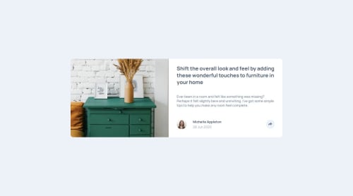
Article component

Solution retrospective
I was able to solve all the problems myself, although I did a lot of googling and tried to learn from other people's code. However, I could not find a single person whose website was fully responsive or at least as responsive as I wanted. It took me days to complete, which may sound hilarious since it is a newbie project but I hammer homed a lot of fundamental knowledge and added new features to my knowledge base. I learned deeply about position absolute and relative interactions, dealing with the color of svgs and shaping them, properly setting the width of the image so that its height fully extends throughout the container without being small.
What challenges did you encounter, and how did you overcome them?The first biggest problem was the height of the image was not the same as the height of the container, so it looked silly. I tried to use rems, percents but at the end I realized to increase the height, I needed to increase the width since I wanted their ratio to stay the same. So, I gave it more width. Next problem was svg coloration. On the internet people said apply filters but to no avail. At the end, I found out that I needed to give a class or id to the path of the svg and directly paste the svg into html without using anything like object, img, picture, video or iframe. Then I applied the fill property, the problem was solved. The next big problem was working with absolute positions. I did not know that absolute positions are positioned relative to the nearest ancestor with position set to relative or smth else. This was an important realization because for mobile the absolute container needed to be relative to the section, whereas in desktop, it was supposed to be relative to the share button. Next up was the problem of whether to use a separate share button when the share button is clicked. I decided to stick one button only. Subsequently, I needed to decide to create two absolute containers, one for mobile, one for desktop. As I said, in two states they were supposed to be relative to different elements. That's why I made that choice. That really solved me the problem of responsiveness. My work was getting very slick. Btw, I also faced a dilemma on whether to use focus, active or hover states for changing the colors of the svg or to add or remove a certain class using javascript. I went for the second option because it seemed more reasonable and easier to implement and did not cause me any problems. Among the final problems was using javascript for showing the containers. I made it so that in a mobile screen, javascript shows the container made for mobile and for desktops, desktop container. It was all cool after all these days of struggle. The final touch was making sure that when resizing a mobile container opened in mobile view disappear when the viewport is resized to desktop size and vice versa. I again used javascript for that and everything worked fine!
What specific areas of your project would you like help with?Please, report any problem you see. I am very very very very open to any form of feedback. Feedback is invaluable to me. Thanks beforehand!
Please log in to post a comment
Log in with GitHubCommunity feedback
- @rdxnandi
Good Job

Join our Discord community
Join thousands of Frontend Mentor community members taking the challenges, sharing resources, helping each other, and chatting about all things front-end!
Join our Discord