Skip to content
  • Unlock Pro
  • Log in with GitHub
Solution
Submitted almost 2 years ago

Article component

accessibility, bem, styled-components, semantic-ui
zHelga•50
@zHelga
A solution to the Article preview component challenge
View live sitePreview (opens in new tab)View codeCode (opens in new tab)

Solution retrospective


How to improve the code? What mistakes are there?

Code
Couldn’t fetch repository

Please log in to post a comment

Log in with GitHub

Community feedback

  • Arkadiusz•200
    @Arkadiusz-coder
    Posted almost 2 years ago

    Hello zHelga, that's nice looking page. I like very much that you have made possible to hide the "social media" section by clicking again on the arrow. Some people forget about providing this feature, and I think this is the best solution for user experience.

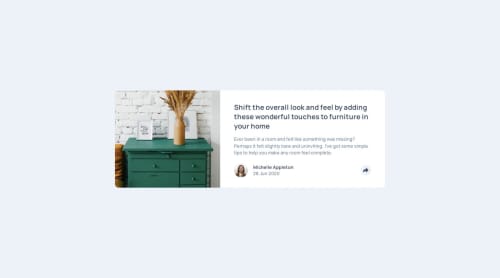
    But I see that your mobile screen lacks a picture, and a picture on the desktop screen is not exactly of the proportions required for the challenge. Did you start your coding from the mobile screen? Because it's good practice in CSS and it is easier to change layout from mobile to desktop. I try it both way, so I know ;)

    In your HTML you placed your .preview_img within the .preview class. It may be that this is the issue that make it hard to put image on the right place and result in the effect of disappearing of the image.

    I resolve it in a way that my image is within class container like yours, but I hold the image within div that is separate from the rest of the component. I declare class "main" under the picture, and within .main I put the rest of the content. Thanks to that it wasn't problem for me to make the picture visible on top of the component.

    The code is like that: ```````html`````

    <div class="container"> <div class="drawer_image_container"> <picture> <img src="images/drawers.jpg" alt="" class="drawer_image"/> </picture> </div> <main class="main"> .... ``````````

    Although I suppose that if you will not make those changes according to above suggestion, but you will start your project from mobile, and then proceed to desktop, problem could also not occur.

    Last but not least, to change the proportions of the picture I made width of the container smaller that that of the picture. Div in which I hold the picture has width property of 295px and the picture's width is 365px. In result the frame of the div covers some part of the picture and make visible only limited area of it. If you will do it, probably the rest of the component will change proportions and you will have to adjust it accordingly.

    I hope that will be helpful. Good lack with this and future projects :)

    Marked as helpful

Join our Discord community

Join thousands of Frontend Mentor community members taking the challenges, sharing resources, helping each other, and chatting about all things front-end!

Join our Discord
Frontend Mentor logo

Stay up to datewith new challenges, featured solutions, selected articles, and our latest news

Frontend Mentor

  • Unlock Pro
  • Contact us
  • FAQs
  • Become a partner

Explore

  • Learning paths
  • Challenges
  • Solutions
  • Articles

Community

  • Discord
  • Guidelines

For companies

  • Hire developers
  • Train developers
© Frontend Mentor 2019 - 2025
  • Terms
  • Cookie Policy
  • Privacy Policy
  • License

Oops! 😬

You need to be logged in before you can do that.

Log in with GitHub

Oops! 😬

You need to be logged in before you can do that.

Log in with GitHub

How does the accessibility report work?

When a solution is submitted, we use axe-core to run an automated audit of your code.

This picks out common accessibility issues like not using semantic HTML and not having proper heading hierarchies, among others.

This automated audit is fairly surface level, so we encourage to you review the project and code in more detail with accessibility best practices in mind.

How does the CSS report work?

When a solution is submitted, we use stylelint to run an automated check on the CSS code.

We've added some of our own linting rules based on recommended best practices. These rules are prefixed with frontend-mentor/ which you'll see at the top of each issue in the report.

The report will audit all CSS, SCSS and Less files in your repository.

How does the HTML validation report work?

When a solution is submitted, we use html-validate to run an automated check on the HTML code.

The report picks out common HTML issues such as not using headings within section elements and incorrect nesting of elements, among others.

Note that the report can pick up “invalid” attributes, which some frameworks automatically add to the HTML. These attributes are crucial for how the frameworks function, although they’re technically not valid HTML. As such, some projects can show up with many HTML validation errors, which are benign and are a necessary part of the framework.

How does the JavaScript validation report work?

When a solution is submitted, we use eslint to run an automated check on the JavaScript code.

The report picks out common JavaScript issues such as not using semicolons and using var instead of let or const, among others.

The report will audit all JS and JSX files in your repository. We currently do not support Typescript or other frontend frameworks.

Oops! 😬

You need to be logged in before you can do that.

Log in with GitHub