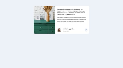
Article preview component

Solution retrospective
Hello, feel free to leave a comment about my code. Any suggestions are welcome.
Please log in to post a comment
Log in with GitHubCommunity feedback
- @ApplePieGiraffe
Hi, Marta! 👋
Good to see you complete yet another challenge! Nice work on this one! 👍
One small thing I might suggest is to vertically center the card component in the viewport in the desktop layout. You can easily do so by adding
min-height: 100vhto thebodyand then using flexbox to center the card component after that. 😉Keep coding (and happy coding, too)! 😁
- @janegca
That looks really good Marta, at both sizes. The only tweak I might suggest is a little less space between the text and the author section. Nicely done :)
- @MasterDev333
Great work @Marta. Your solution is spot on. One suggestion, it would be better if you add some transitions on buttons. Overall, well done! Happy coding~ :)


Join our Discord community
Join thousands of Frontend Mentor community members taking the challenges, sharing resources, helping each other, and chatting about all things front-end!
Join our Discord