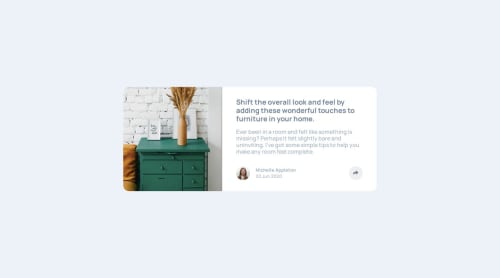
Article Preview Component

Solution retrospective
Most proud my use of class list toggling along with the styling it triggered. Took me a bit working out the kinks, overall I feel like I did a good job.
What challenges did you encounter, and how did you overcome them?Big challenge was getting the share bubble to position where I wanted it to due to added spacing that I wasn't 100% sure off. I used negative values on any added margin. I'm not sure if that's the norm, but it got the job done. I'd love to hear about any tips and tricks y'all may have used.
Please log in to post a comment
Log in with GitHubCommunity feedback
- @adeysh
Hey there! I see you did a good job replicating the design with good html structure. However here's what I would suggest 😇 (I have provided you feedback just scrolling through your code sequentially top-down):
-
I think you have added the scipt link for font-awesome icons 2 times by accident. You can remove it.
-
wrap the card in a
<article>tag rather than<main>because it can be used independently anywhere. -
Use
<picture>tag to change the picture used in the card at different screen sizes. I think you have used a single picture so you can style it withobject-positionproperty for mobile screens. Look at the mobile designs closely you will find that they are kind of cropped from top and bottom. -
Also you have used an
imgtag inside yourcard__imgdiv but you have given a background image to yourcard__imgdiv which is redundant and not useful. Use one way to render your image and be consistent. -
For the other end of the card i don't think
asideis semantically correct to be used here. It's just the content for the card that is typically used in any card layout so rather you can just wrap it in a div withcard__contentclass or asectionto be more semantic. -
Inside your
<article>since you have used<wrapper>to style it with padding you can remove and put styles for it rather directly in thearticletag. -
Since you're using bem naming convention, try to use bem classes for your components with classes and use only those classes to style it. Also try to divide them mindfully looking for any repeating styles that you can create a class which can act as utility like font-styles and flex-box styles.
-
Never use
footerinside themaintag. Since this is a card component the footer is not particularly required as such but even if you want to use it you can do inside yourarticletag and with a specifying class likecard__footerto show that this footer belongs only to the card only. -
Inside your footer section, the card author and date could be wrapped inside a more meaning-full class like
card__profileorcard__profile-container. Also they are more like block elements rather than sections since they only have a single line of text. -
The share section and share button is good as is. Good job
-
On click of the share button the card author text and date get shifted somewhat to the right you can fix it.
-
Try to be consistent with font-sizes preferable using rem units in your css.
-
Use your variables you have defined for font-sizes.
-
Rather than using separate class for flex-styles or disply:none you can create a separate class and add it to whatever tag you want.
This may seem a very verbose feedback but try to refactor your code and make it DRY. Otherwise that's a really good looking card 🤩🤞
Marked as helpful -

Join our Discord community
Join thousands of Frontend Mentor community members taking the challenges, sharing resources, helping each other, and chatting about all things front-end!
Join our Discord