Article preview component

Solution retrospective
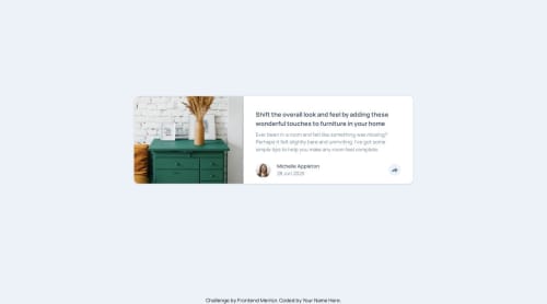
Clean Structure and Layout: You've built a responsive, well-structured component using semantic HTML (<article>, <h1>, <p>, etc.) and Tailwind CSS. The use of flexbox for alignment and responsive classes like md:flex-row is solid.
Alpine.js Interactivity: You're using Alpine.js to toggle the share popup effectively. The use of x-data, @click, x-show, and x-transition is correct and keeps the logic lightweight and declarative — perfect for this kind of UI component.
Responsive Design Consideration: You've considered how the UI shifts between mobile and desktop, especially in the way the share popup is positioned (md:left-1/2 md:bottom-full etc.), which shows good attention to UX across devices.
What challenges did you encounter, and how did you overcome them?🔄 Toggle Logic for the Share Popup (with Alpine.js): Ensuring the share popup appears in the right position and closes correctly on outside click or button toggle can be tricky, especially with Alpine.js, where component reactivity is declarative but limited compared to full frameworks.
📱 Responsive Positioning of Popup: On mobile, the popup needed to be placed above the share button, while on desktop, it had to be positioned differently (bottom-full and left-1/2). Tailoring this behavior with Tailwind’s responsive utilities and absolute positioning took experimentation and trial-and-error to get it pixel-perfect.
📦 Z-Index and Layering Conflicts: When using Tailwind’s utility classes like z-20, absolute, and positioning, it can be easy to have layering issues, especially if the share popup ends up behind other content — or overlaps improperly.
What specific areas of your project would you like help with?Accessibility Improvements (a11y): I’d appreciate guidance on making the share popup more accessible — for example, ensuring keyboard navigation, focus trapping, ARIA roles, and screen reader compatibility.
Transition and Animation Enhancements: While I used basic Alpine.js transitions (x-transition), I’d like to explore smoother, more engaging animations — maybe using a minimal library like GSAP or improving timing/easing within Tailwind’s utility constraints.
Handling Edge Cases and Robustness: I’m interested in better ways to handle edge cases like:
When multiple components are open at once
When window resizes mid-interaction
Preventing accidental popup closure when interacting near the edge
Scalability & Reusability: I'd like advice on abstracting the popup logic into a reusable component or Alpine.js plugin/module to prevent duplication if I use this across different buttons or modals in the app.
Please log in to post a comment
Log in with GitHubCommunity feedback
No feedback yet. Be the first to give feedback on newJSHacker's solution.
Join our Discord community
Join thousands of Frontend Mentor community members taking the challenges, sharing resources, helping each other, and chatting about all things front-end!
Join our Discord