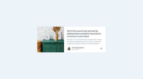
article-preview-component

Solution retrospective
The most noticeable challenge I encountered while doing this project was calculating the share button's position. My first thought was to use position: absolute for the media container and position: relative for the share button. However, when it came to the mobile layout, I needed to calculate the full width, and in that case, the first approach wasn’t effective.
My second thought was to use the getBoundingClientRect() function to calculate the share button's position first and then calculate the full container's position on mobile devices. But I encountered some bugs when it came to resizing and clicking, and I also faced some issues with the overflow method.
Finally, I created two media containers: one for the desktop layout and the other for the mobile layout.
What specific areas of your project would you like help with?So, to overcome and complete this challenge, I created two media containers:
-
The first one is for the desktop layout, which I placed inside the tag. (This is because when the media container becomes position: absolute, I want the share button—also inside the tag—to be positioned relative to it and correctly calculate the position to center the media container.)
-
The second one was placed outside the tag (as a sibling of ). I did this to calculate the 's width and position, which I used to determine the media container's position for the mobile device layout.
Question: Is this approach—creating two similar elements and showing one while hiding the other at different times—considered bad practice?
Please log in to post a comment
Log in with GitHubCommunity feedback
No feedback yet. Be the first to give feedback on TornikeTt's solution.
Join our Discord community
Join thousands of Frontend Mentor community members taking the challenges, sharing resources, helping each other, and chatting about all things front-end!
Join our Discord