Article Preview Component - Did I make this accessible enough?

Solution retrospective
Hello everyone! 👋
Woohoo! This is solution number ten for me 🎉
I have been self-learing since May 2021 and besides just learning about HTML, CSS and JS, I am also trying to learn about accessibility and responsiveness.
❓️ Specific Questions
-
I ran my first solution for this challenge through an Color Contrast Accessibility Validator and the colours in the design did not have a high enough contrast, so I converted the colours to HSL and lowered the lightness untill they passed. Is that ok? Is this something you usually discuss with the designer?
-
I also made the font slightly bigger for better readability. Ok or also a designer choice to make it, in my opinion, too small?
-
I changed the
outlinewhen the button gets focus to a color from the design. Is this a good thing to do of better leave it alone? -
Did I give every item that needs accessibility
labelandalt, etc, in the right way?
I would much like to become a better developer, so any advice you can give me is very welcome, also if it does not regard my specific questions.
Have a nice day! 🙋♂️
Please log in to post a comment
Log in with GitHubCommunity feedback
- @SJ-Nosrat
Hi Roy, Beautiful solution! A lot to learn here for me! With regards to your questions find below in my humble opinion:
-
Part of Web Development, besides making websites beautiful and aesthetically pleasing, there's the user experience issues and this is a broad topic: however we must consider the user experience of individuals that have issues with their eyesight eg: colorblindness, contrast, etc. It's too broad a topic; which requires for us to be part of a TEAM and discuss, develop and implement such issues.
-
This again relates to bullet point (1).
-
That's fine! Draws the user's attention to having the button in an active state (visually speaking).
-
I would direct to think about using semantic HTML that's why they've been introduced natively for HTML 5. Also, for accessibility reasons: include the
aria-hidden="true"attribute for the following element:<div class="main__image"></div>since I'm sure it's being used to apply abackground-image. -
I noticed when you mouse click on the share button, I'll have to click the share button again to collapse the options, can you make it so that clicking anywhere on the screen will collapse the options as this is more convenient.
Lastly: could you teach me about the below code in your
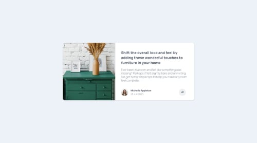
<head>:<meta name="twitter:card" content="summary_large_image" /> <meta name="twitter:title" content="RS | Frontend Mentor | Article preview component" /> <meta name="twitter:description" content="Read this article: Shift the overall look and feel by adding these wonderful touches to furniture in your home!" /> <meta name="twitter:image" content="https://raw.githubusercontent.com/Lumensum/FEM-article-preview-component/master/screenshot.png" />What does the above code do in your HTML structure?
In Summary: your approach is correct and considering accessibility is the job of the Frontend Developer; having said that, this involves working part of a team and bouncing off such issues that you bring up.
Hope the above helps!
Best of luck with your coding journey!
-

Join our Discord community
Join thousands of Frontend Mentor community members taking the challenges, sharing resources, helping each other, and chatting about all things front-end!
Join our Discord