


@SJ-Nosrat
Posted
Hi Roy, Beautiful solution! A lot to learn here for me! With regards to your questions find below in my humble opinion:
-
Part of Web Development, besides making websites beautiful and aesthetically pleasing, there's the user experience issues and this is a broad topic: however we must consider the user experience of individuals that have issues with their eyesight eg: colorblindness, contrast, etc. It's too broad a topic; which requires for us to be part of a TEAM and discuss, develop and implement such issues.
-
This again relates to bullet point (1).
-
That's fine! Draws the user's attention to having the button in an active state (visually speaking).
-
I would direct to think about using semantic HTML that's why they've been introduced natively for HTML 5. Also, for accessibility reasons: include the
aria-hidden="true"attribute for the following element:<div class="main__image"></div>since I'm sure it's being used to apply abackground-image. -
I noticed when you mouse click on the share button, I'll have to click the share button again to collapse the options, can you make it so that clicking anywhere on the screen will collapse the options as this is more convenient.
Lastly: could you teach me about the below code in your <head>:
<meta name="twitter:card" content="summary_large_image" />
<meta
name="twitter:title"
content="RS | Frontend Mentor | Article preview component"
/>
<meta
name="twitter:description"
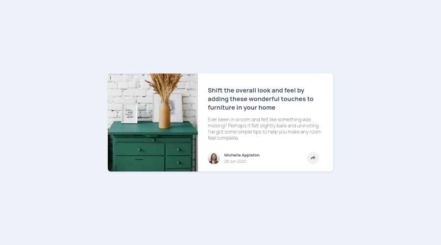
content="Read this article: Shift the overall look and feel by adding these wonderful touches to furniture in your home!"
/>
<meta
name="twitter:image"
content="https://raw.githubusercontent.com/Lumensum/FEM-article-preview-component/master/screenshot.png"
/>
What does the above code do in your HTML structure?
In Summary: your approach is correct and considering accessibility is the job of the Frontend Developer; having said that, this involves working part of a team and bouncing off such issues that you bring up.
Hope the above helps!
Best of luck with your coding journey!
