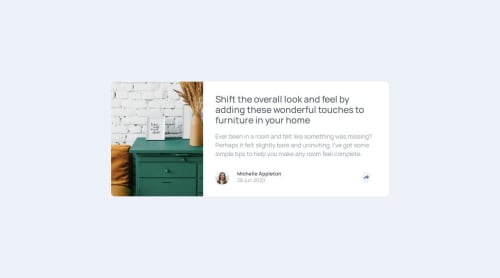
Article-preview-component

Please log in to post a comment
Log in with GitHubCommunity feedback
- P@laurice-dev
You are doing great work and I am very glad to be reviewing your submission.
#HTML Your HTML looks fantastic—well-structured and easy to review. One suggestion I’d offer is regarding your use of the <section> tag, specifically in this example: <section class="img"></section>. You might consider using a <div> or another more semantically appropriate element instead.
The reason is that <section> is typically used for grouping related content and often includes a heading element like <h1>, <h2>, or <h3>. It’s generally intended for standalone sections of content with an intended purpose (such as a specific website component). That said, your current implementation still works—this is just a suggestion to align more closely with semantic HTML best practices.
Reference: https://developer.mozilla.org/en-US/docs/Web/HTML/Reference/Elements/section
#CSS Your CSS is clean and very easy to read. Kudos! Just a couple of small notes to share.
I noticed your breakpoint is set around 1200px, which might be a bit early since that range still includes many desktop screen sizes (typically 1024px to 1200px). You might consider shifting the breakpoint to a slightly smaller width to better target tablet or smaller device layouts. Just a suggestion—your current setup still works well!
Another tip: I noticed you're setting fixed widths on some elements, like in .share { width: 330px; }. While this works, it can make your layout less responsive on smaller screens. Instead, consider using max-width—this allows the element to shrink as the screen size decreases, making your design more flexible and mobile-friendly.
#JS JS was easy to read and very clean as well.
I kindly noticed you're using inline styles within your <div>, like this:
<div class="share" id="share" style="display: none;">While this works, you might consider using CSS classes to manage visibility instead. For example, you could create .share--inactive and .share--active classes to represent the different states:
<div class="share share--inactive" id="share"></div>.share--inactive { display: none; } .share--active { /* your visible state styles here */
Then, in your JavaScript, you can toggle these classes using addEventListener and classList.toggle() or classList.add/remove. This approach keeps your HTML cleaner and separates structure from styling, which is a good practice in modern web development.
Overall, you are doing wonderfully and we're all in this together! Happy to review your work and keep up the great work!
Marked as helpful

Join our Discord community
Join thousands of Frontend Mentor community members taking the challenges, sharing resources, helping each other, and chatting about all things front-end!
Join our Discord