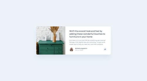
Article Preview Component - HTML CSS JS and Responsive Design

Solution retrospective
I feel very proud of having completed this challenge because it helped me understand flexbox a little more.
What challenges did you encounter, and how did you overcome them?It was a good challenge to be able to create the message box and when going to mobile change the shape to fit the card.
What specific areas of your project would you like help with?Any help is welcome.
Please log in to post a comment
Log in with GitHubCommunity feedback
- @krushnasinnarkar
Hi @JMBeltranDev,
Congratulations on successfully completing the challenge!
I have a suggestion regarding your code that I believe will be of great interest to you.
-
Instead of using
@media (width < 1000px), you should use@media (max-width: 1000px). This is the correct way to write it. -
For the
.cards, usemax-width: 20.4375rem;instead ofwidth: 20.4375rem;for small screens to ensure better responsiveness:.cards { max-width: 20.4375rem; } -
Add some margin to the
mainelement, around20px, so it doesn’t touch the screen when the screen size is very small:main { margin: 20px; }
I hope you find this helpful, and I would greatly appreciate it if you could mark my comment as helpful if it was.Feel free to reach out if you have more questions or need further assistance.
Happy coding!
Marked as helpful -

Join our Discord community
Join thousands of Frontend Mentor community members taking the challenges, sharing resources, helping each other, and chatting about all things front-end!
Join our Discord