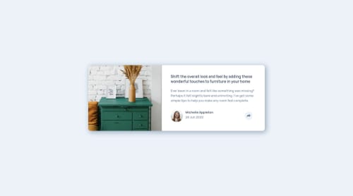
Submitted over 2 years agoA solution to the Article preview component challenge
Article preview component

@Reno08-code
Solution retrospective
Hi Lovely People Please leave your feedback to help me improve:)
Code
Please log in to post a comment
Log in with GitHubCommunity feedback
- P@visualdenniss
Congrats on completing the challenge successfully! Your submission looks great on desktop size. However you can tweak the responsiveness for changing the flex-directin to column in mobile view. You can use media queries for that. For example:
.container-card { flex-direction: column; }
in this case you would also need to make the main image to have 100% width, (if it gets distorted, you can use object-fit: cover)
Hope you found this helpful!
Marked as helpful

Join our Discord community
Join thousands of Frontend Mentor community members taking the challenges, sharing resources, helping each other, and chatting about all things front-end!
Join our Discord