Submitted 11 months agoA solution to the Article preview component challenge
Article-Preview-Component

@hmac100
Solution retrospective
What are you most proud of, and what would you do differently next time?
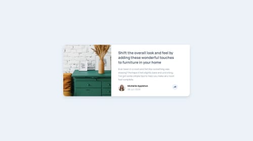
Second attempt - the breakpoints are a bit more seamless. I feel the overall result is more robust and closer to the design.
What challenges did you encounter, and how did you overcome them?The active mobile layout got me - but with the help of relative and absolute positioning I got things looking reasonably ok . I think ?
What specific areas of your project would you like help with?Not walking away feeling super smug about this one. Reckon I've got substantial bloat in the css. Not sure how to refactor it. The HTML semantics were another thing that in hindsight needed to be more concise. I'll be sticking this on discord for some sage advice.
Code
Couldn’t fetch repository
Please log in to post a comment
Log in with GitHubCommunity feedback
No feedback yet. Be the first to give feedback on Ham's solution.
Join our Discord community
Join thousands of Frontend Mentor community members taking the challenges, sharing resources, helping each other, and chatting about all things front-end!
Join our Discord