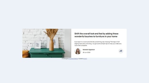
Submitted 11 months agoA solution to the Article preview component challenge
Article Preview Component Practise
LVL 2

@Kofi100
Solution retrospective
What are you most proud of, and what would you do differently next time?
Being able to finish the project after watching a video ro two,I think.
What challenges did you encounter, and how did you overcome them?Being able to create the layouts for both desktop and mobile and also using JavaScript to auto-adjust the page based on the viewport's size(more precisely,it's width.
What specific areas of your project would you like help with?Feedback on the layout and code of the project would help. Thanks 😄🙏
Code
Loading...
Please log in to post a comment
Log in with GitHubCommunity feedback
No feedback yet. Be the first to give feedback on Kofi K’s solution.
Join our Discord community
Join thousands of Frontend Mentor community members taking the challenges, sharing resources, helping each other, and chatting about all things front-end!
Join our Discord