


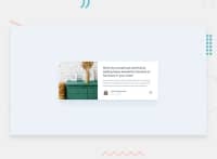


Fraser Watt• 1,790
@fraserwat
Posted
This looks really great - very clean, especially at desktop width!
Couple changes:
- at mobile widths, you'll want to remove the
width: 24remon .card__image, as if you move the screen to 600-750 ish px wide the picture doesn't stretch across the whole div - Likewise, on your (max-width: 774px) media query, get rid of the
height:on .card__body - you tend not to want to explicitly define the height in divs with content in them, and it's leading to a lot of white space around this width. This will introduce a padding issue, which you can also solve by removing thepadding-bottom: 0;line from the same element.
Keep it up!
Marked as helpful
1
Juan Pablo Urra• 230
@ojitxslml
Posted
@fraserwat Thanks! I will try those changes 🙌
0
