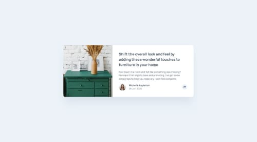
Article Preview Component using HTML/SCSS and JS

Solution retrospective
Proud of implementing the project very close to the designs.
I would try to create it faster since now it's becoming kind of easy for me to make layouts
What challenges did you encounter, and how did you overcome them?-
The project was about the intro to JS and was just the javascript action for the popup that appears on click of the share button. I was able to do that also looking out for accessiblity for keyboard users.
-
The main challenge was rather some other things:
-
I had problems with changing particular colors for the svg used but was able to find some answers.
-
Also I thought that a cropped version of image used in card image for the mobile styles were not provided so rather I cropped it myself for the sake of just having another image 😂 After looking at other solutions I found out that I just had the style the image that was already provided using
objectcss properties to position it correctly but then I just let it be because it was looking ok. -
I had problems with positioning the share button popup that was supposed to be a popover element outside the card. After looking at some solutions I found that It is easy to just create a container outside your card and then you can use it to place it anywhere according to your design.
- One thing I was confused with was about adding a transition to an element when a class is removed from it. I actually added a simple transition effect when I was adding an
--activeclass over the button click and then styled the popup. I wanted to remove the popup with the same transition effect when I removed the class on another button click but it was not working. - After searching some solutions on stack overflow I found that for this with removing a class I will have to add another class like
hiddenand apply transition effect with that or I can just listen totransitionendevent in my js and add a transition effect there. I was not able to achieve it in my code though. - So if you guys follow with any suggestion about how to do it in simple way. Please provide me 😅
Please log in to post a comment
Log in with GitHubCommunity feedback
- @petrihcour
The design for desktop is really close. Great job. I like the transition effects you added.
I'd keep an eye out on the responsiveness for the tablet version. The tablet version on the site looks like a giant version of the mobile, but should be a smaller version of the desktop.

Join our Discord community
Join thousands of Frontend Mentor community members taking the challenges, sharing resources, helping each other, and chatting about all things front-end!
Join our Discord