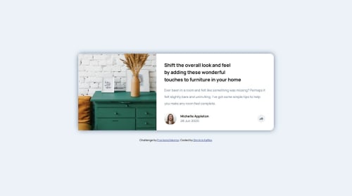
Article preview component with a share popup

Solution retrospective
I believe I kept my code relatively clean.
Next time I will further investigate the important accessibility elements that are needed in challenges like this.
What challenges did you encounter, and how did you overcome them?I managed to figure out (after some investigation) how to place the popup content relative to two different containers for the mobile and the desktop view.
What specific areas of your project would you like help with?- The popup content (
share-content-wrapper) is not perfectly centered above the share icon.
I used:
	left: 50%;
	transform: translateX(-50%);
	top: -70px;
How do i correct this misalignment?
- How can I change the color of the arrow icon when the icon is pressed? I used the
icon-share.svgimage file from the given design files.
Please log in to post a comment
Log in with GitHubCommunity feedback
- P@morauszkia
Hi there,
If you would like, check out my solution: https://github.com/morauszkia/fm-article-preview
I think it works sufficiently well, and is not too complicated.
My basic approach was the same: I also used absolute positioning relative to the footer part of the card. But I used relative units and the calc function to position my element:
- The translateX(-50%) is the same
- but I used a different approach with the left: I used calc, to subtract from 100% (all the way to the right of the footer) the size of the padding (2rem) + the half of the icon container's width (1rem), and this has put the left edge to the center of the icon container (the circle around the share icon). As in your case, the translateX moved it to the left with half the size of the element. If you want to keep the code maintainable, you can use css variables for the padding and the share icon container size, and put them into the respective css declarations, and the calc as well, so later you have to change the sizes only in one place in your code.
- In case of top my approach was similar with the negative values, only I used percentages instead of pixels.
As to the icon: I changed the background color, if the .icon-container has class open (the JS takes care of this part), and applied a brightness filter to the svg itself. (Lines 153-159 in the styles.css)
Marked as helpful - P@morauszkia
But now as I see, your solution is perfectly aligned (at the desktop size). Did I misunderstand your problem? Is it with the mobile version?

Join our Discord community
Join thousands of Frontend Mentor community members taking the challenges, sharing resources, helping each other, and chatting about all things front-end!
Join our Discord