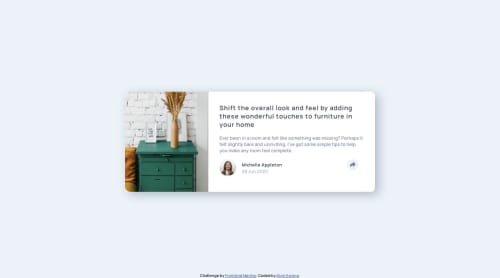
Submitted almost 5 years agoA solution to the Article preview component challenge
Article Preview Component with only HTML, CSS, and some JS

@akwong372
Solution retrospective
I'd love some general pointers on how to improve my CSS.
Code
Please log in to post a comment
Log in with GitHubCommunity feedback
- @ApplePieGiraffe
Good work!
I'd also add some padding to the left and right sides of the component so that there's some space between it and the edges of the viewport when you resize your screen.
👍
- @ezraguy
Looks good! , I would change 2 things...
-
I would change the media query to a
@media screen and (max-width: 700px)because as of now elements break on around 615px width like the "poster-name" and "poster-date". -
I would add
overflow-x: hiddento the body CSS to prevent the horizontal scroll.
-


Join our Discord community
Join thousands of Frontend Mentor community members taking the challenges, sharing resources, helping each other, and chatting about all things front-end!
Join our Discord