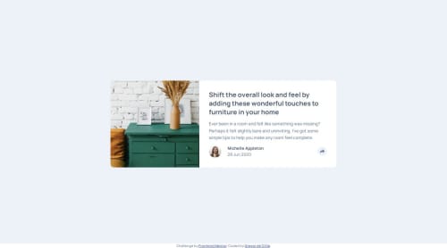
Article Preview Component with Toggletip

Solution retrospective
The js part came together pretty easily. Getting the styling for the tooltip right was a bit messy which is why I would think about that part earlier the next time around.
What challenges did you encounter, and how did you overcome them?I had to do some experimentation with absolute positioning for the tooltip. Adjusting the crop-direction required some MDN reading. For the layout shift between mobile and desktop (img left vs top), I initially used grid but switched to flex later.
What specific areas of your project would you like help with?Tooltips are notorious for being hard with accessibility and there are different suggestions floating around depending on usecases. If you could give me your suggestion on how to make it work for this design, that would be great.
- I remembered this article from an earlier project (back when I knew much less about web) and gave it another read: https://inclusive-components.design/tooltips-toggletips/.
- Another idea I had was to make the tooltip an
.sr-onlyelement for screenreaders and a toggleable element for other users. - There is also the
aria-expandedattribute which is often used with expandable nav elements which also seems to fit.
The amount of options feels very overwhelming to me which is why the current accessibility of the tooltip is at a very bad state. display: none removes the tooltip from the accessibility DOM until a screenreader user triggers a click event on a non-focusable element :(.
Please log in to post a comment
Log in with GitHubCommunity feedback
No feedback yet. Be the first to give feedback on Gregor de Cillia's solution.
Join our Discord community
Join thousands of Frontend Mentor community members taking the challenges, sharing resources, helping each other, and chatting about all things front-end!
Join our Discord