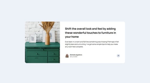
Article Preview

Solution retrospective
I am getting better at using media queries and making different screen sizes adapt to my web page.
What challenges did you encounter, and how did you overcome them?Struggled to overcome them but I didn't know how to make an absolutely positioned element adapt to different screen sizes. I'm guessing that you have to have several media queries in place to keep an absolutely positioned element in one spot. I only had one for 400px for mobile.
What specific areas of your project would you like help with?More overall practice. I am excited for Javascript
Please log in to post a comment
Log in with GitHubCommunity feedback
- P@Sven-27
Hi unfortunatly i can not view your code because i am getting an error. But based on looking on the page itself. I see that the responsiveness is not perfect. Especcially for the midsized screens. This is something that needs attention.
And the second thing is the placing of your social icons component is not how it should be. For midsize screens and larger screens it should stick to the right like in the designs. If you slide the size of the screens it does not stay in place. And for mobile it should fall over the author section. You can achieve that with position: absolute; inset: 0;
Hope you can use this.
Marked as helpful

Join our Discord community
Join thousands of Frontend Mentor community members taking the challenges, sharing resources, helping each other, and chatting about all things front-end!
Join our Discord