Submitted over 4 years agoA solution to the Article preview component challenge
Article Preview w/ HTML, CSS, Vanilla JS
LVL 2

@jma26
Solution retrospective
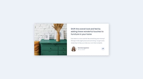
I ended using CSS Grid for the layout of the mobile and desktop designs. Unfortunately I had a hard time lining up the social-media toggle box to line up with the share button (not sure it's because in CSS Grid?) and in order to line it up visually, I increased the padding but that resulted in a thicker-looking box. How did you guys approach this?
I'd love to hear any feedback or suggestions on what I could improve on! Any insight is greatly appreciated!
Thank you! #happycoding
Code
Loading...
Please log in to post a comment
Log in with GitHubCommunity feedback
No feedback yet. Be the first to give feedback on Jesse Ma’s solution.
Join our Discord community
Join thousands of Frontend Mentor community members taking the challenges, sharing resources, helping each other, and chatting about all things front-end!
Join our Discord