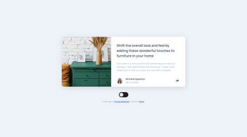
Article preview with cool animation and dark mode

Solution retrospective
This is my solution for Article Preview Component with dark mode and cool circular expanding reveal animation for share menu in mobile view and fade-in animation in desktop.
The most difficult part for me was to position the share menu in desktop mode. I ended up using properties and calc to calculate its position so that it stays in center even if we add more links later.
Another part is accessibility. I did try to make it accessible but I am not sure if I missed something or overdid something.
For show/hide share menu, I have used data attribute instead of toggling class which is as per cube-css methodology.
For JS, I decided to use query selector instead of id. This allows to add multiple cards without any issue. But I think in real projects using any library like react, it is better to just use states.
Do let me know your thoughts :-)
Please log in to post a comment
Log in with GitHubCommunity feedback
No feedback yet. Be the first to give feedback on Azhar's solution.
Join our Discord community
Join thousands of Frontend Mentor community members taking the challenges, sharing resources, helping each other, and chatting about all things front-end!
Join our Discord