Astro, WCAG Accessibility, Sticky Navigation, Revealing Footer

Solution retrospective
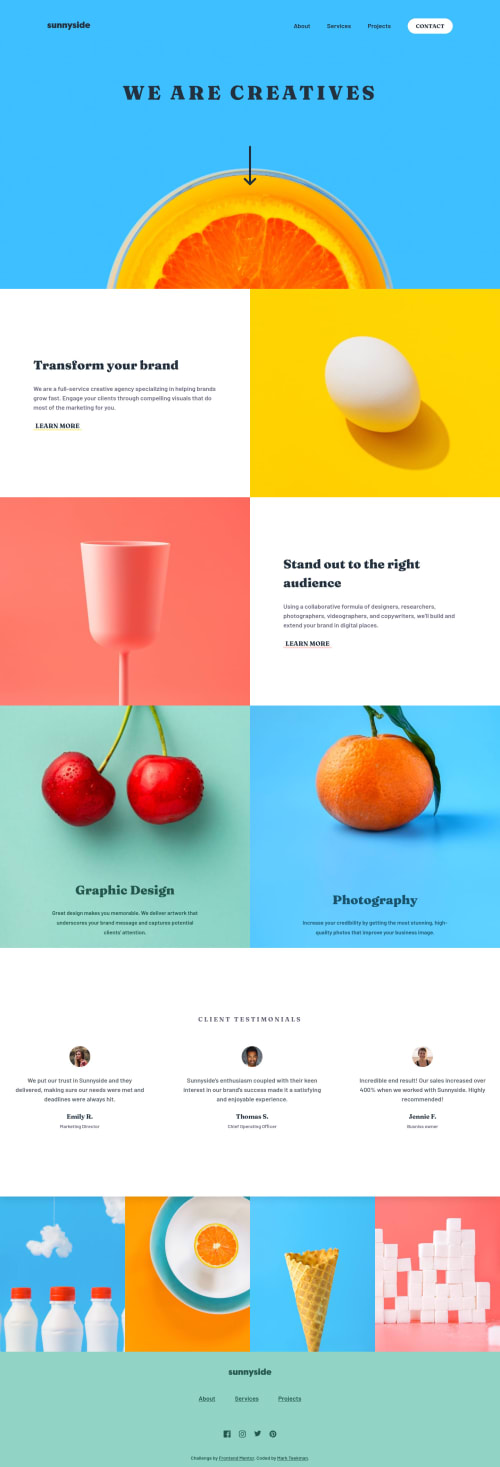
When I'm working on challenges from Frontend Mentor I try to get it as accessible as possible. Sometimes this means I have to differ from the design, such as with this challenge. I for example went with a dark font for the navigation and the hero to comply with the contrast ratio between the font and the light blue background. To keep it consistent I also applied this to the arrow, hamburger and logo SVG's. However, having a white font and white SVG's looks much better in my opinion. I want to know if there are other ways to stay more true to the design, whilst having the right contrast ratio and accessibility between the font and the background color. Let me know if you have any ideas! :)
Please log in to post a comment
Log in with GitHubCommunity feedback
No feedback yet. Be the first to give feedback on Mark Teekman's solution.
Join our Discord community
Join thousands of Frontend Mentor community members taking the challenges, sharing resources, helping each other, and chatting about all things front-end!
Join our Discord