


@shubhamthedev
Posted
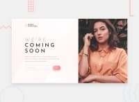
Hi @CaroAFR, first of all welcome to the community and congratulations on completing your first project. Your design is definitely closer to mock-ups provided but here are some suggestions that i would give you:
-
The hero image is actually overflowing the page and shouldn't exceed the view-port height since it is a single page website.
-
I see that you've used 2
<h1>in your code which isn't a good practice since the search engines use this for displaying top page hits and hence only one h1 should be used. You could instead use<span>elements inside h1 and style them differently. -
Margins don't seem to be proper, you should space your items well for easy reading.
-
The placeholder font isn't centered and should be pink instead of black.
-
The website is responsive on phones and desktop but not for tablets.
-
You should always add alt attribute to images since, if they fail to load or something goes wrong and they aren't visible then this text is used in it's place plus screen readers use this for visually impaired people.
Those were some of my suggestions and you could look at my code for reference if you want Base-Apparel and here is the live version of the site Live-Version.
Hope this helps and happy coding 😊.
@CaroAFR
Posted
Thank you for your feedback! I'm going to implement those things, I've just started learning and I was not sure on how to do some things. Thank you for your help :)
