@tatasadi
Posted
Hey there,
Good job on completing this challenge! Your implementation showcases a good understanding of HTML and CSS fundamentals. Here are some suggestions to refine your project further:
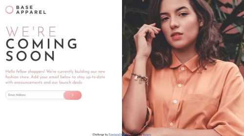
Fixed Position of Attribution: The current fixed positioning of the attribution can cause overlapping issues on smaller devices. To prevent this, consider placing the attribution within the flow of the document, perhaps at the bottom of the main content. This will ensure it doesn't overlap with other elements on smaller screens.
Email Validation Logic: The JavaScript logic for email validation could be more robust. Instead of just checking for the presence of an "@" symbol, use a regular expression to validate the email format. For example:
const emailRegex = /^(([^<>()\[\]\\.,;:\s@"]+(\.[^<>()\[\]\\.,;:\s@"]+)*)|(".+"))@((\[[0-9]{1,3}\.[0-9]{1,3}\.[0-9]{1,3}\.[0-9]{1,3}])|(([a-zA-Z\-0-9]+\.)+[a-zA-Z]{2,}))$/;
if (!emailRegex.test(emailInput.value)) {
// Show error
} else {
// Success action
}
This will provide a more accurate validation for email addresses.
See this link for more info.
Alt Attribute for Error Icon: Always include an alt
attribute for images to improve accessibility. For the error icon, you can add alt="Error icon"
to describe the image. This helps screen readers and users who cannot see the image understand its purpose.
Consistent Units in CSS: You've used both em
and rem
units for padding in your button style. It's best to stick to one unit for consistency. rem
units are often preferred for responsive designs as they are relative to the root font size and provide more consistent scaling.
Implementing these suggestions will enhance the functionality, accessibility, and responsiveness of your project. Keep up the good work!
Marked as helpful