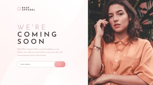
Submitted almost 4 years agoA solution to the Base Apparel coming soon page challenge
Base Apparel coming soon page

@catherineisonline
Solution retrospective
Hello, Frontend Mentor community! This is my solution to the Base Apparel coming soon page.
I appreciate all the feedback you left that helped me to improve this project. Due to the fact that I published this project very long ago, I am no longer updating it and changing its status to Public Archive on my Github.
You are free to download or use the code for reference in your projects, but I no longer update it or accept any feedback.
Thank you
Code
Loading...
Please log in to post a comment
Log in with GitHubCommunity feedback
No feedback yet. Be the first to give feedback on 👾 Ekaterine Mitagvaria 👾's solution.
Join our Discord community
Join thousands of Frontend Mentor community members taking the challenges, sharing resources, helping each other, and chatting about all things front-end!
Join our Discord