


@statanasova
Posted
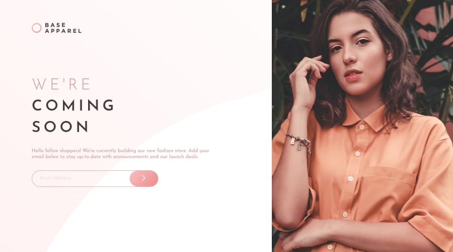
Pretty good work on the desktop version!
Try adding object-fit: cover to the .hero img - it will keep the image in the proper aspect ratio on all resolutions.
About the mobile version - yes, you can use Flexbox or Grid with some media queries to switch between mobile/desktop and other resolutions.
If you are new to both methods, I'd suggest to start learning Flexbox first, as it is a bit easier to understand. Here are some free resources to get you started:
Learn Flexbox for free on Scrimba
Wes Bos and Scrimba have free courses on CSS Grid as well.
Happy coding!
PS. Upvote if any of this was helpful :)
@utkarsh-UK
Posted
@statanasova Thanks for your suggestions buddy. It was really needed. I'll checkout the links surely.
Thanks again!


