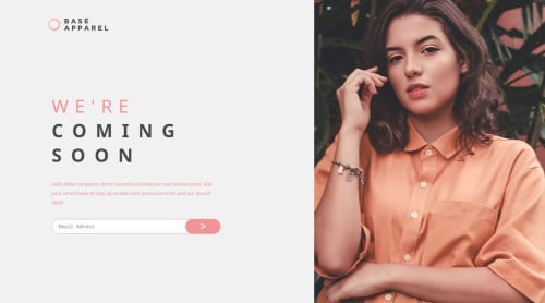
Base Apparel coming soon page

Solution retrospective
I was happy to have managed to work with the site responsively, displaying the way I wanted both on the computer and on the phone.
What challenges did you encounter, and how did you overcome them?The main challenge was ensuring the site displayed consistently across devices, particularly adjusting layouts and elements to fit different screen sizes. I overcame this by:
Learning and Using CSS Flexbox and Grid: These tools helped structure the layout dynamically, adapting to varying screen sizes effectively.
Testing on Multiple Devices: I consistently tested the site on both desktop and mobile devices to identify and fix inconsistencies.
Utilizing Media Queries: By writing specific CSS rules for different screen resolutions, I was able to customize the site’s appearance for each device.
Debugging Responsively: Browser developer tools, like Chrome DevTools, allowed me to simulate different screen sizes and troubleshoot issues efficiently.
What specific areas of your project would you like help with?I’d like help with the following areas of my project:
Optimization: Suggestions for improving loading speed and performance on mobile devices. Accessibility: Ensuring the site meets accessibility standards (e.g., ARIA roles, contrast ratios). Cross-Browser Compatibility: Identifying potential issues and solutions for ensuring consistent behavior across different browsers. Responsive Design Best Practices: Tips or feedback on improving responsiveness further, especially for unusual screen sizes. Code Review: Insights on improving my HTML, CSS, or JavaScript for cleaner, more maintainable code.
Please log in to post a comment
Log in with GitHubCommunity feedback
No feedback yet. Be the first to give feedback on Yuri Augusto Bernardes de Sousa's solution.
Join our Discord community
Join thousands of Frontend Mentor community members taking the challenges, sharing resources, helping each other, and chatting about all things front-end!
Join our Discord