


@dusan-b
Posted
Hello Jeanco,
You can allow the browser to choose the appropriate image depending on the screen size by using the <picture> element.
Here's an example:
<picture>
  <source srcset="images/hero-desktop.jpg" media="(min-width: 900px)">
  <img src="images/hero-mobile.jpg" alt=" Some alternative text">
</picture>
This way, the browser will load the desktop image if the viewport width is equal to or greater than 900px, and otherwise it will load the mobile image.
You can also add more image versions and screen conditions by adding multiple <source> elements. The image in <img> also serves as a fallback if the browser doesn't support the <picture> element.
Stephanie Eckles has written a great article about responsive images that you may find interesting:
Hope this helps. Keep going, and happy coding :).
@engsofjvolfe
Posted
@dusan-b I appreciate this comment, well, actually your suggestion was my first attempt, but i don't know how to change the flow of the "img" element for the sake of changing it's position inside or outside specific "divs". I mean, if i put the <picture> inside my class .right-side, so i cant make the image occupy the left side while on desktop flow, and the contrary is true as well (i tried grid template and others but i'm still limited). I appreciate more details if u could provide about how to use the picture element in this specific exercise. Thank u so much
@dusan-b
Posted
@engsofjvolfe I think I understand what you mean and have taken a closer look at your code.
First, the header element should be placed right after the opening body tag, not inside section. By the way, section should be replaced by main.
<body>
<header>
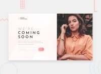
<img class="logo" src="images/logo.svg" alt="logo base apparel">
</header>
<main>
<div class="right-side">
</div>
<picture>
</picture>
</main>
</body>
This HTML structure is valid and makes it much easier to create a responsive layout. As the image belongs at the top of the page on smaller screens, you can use Grid together with the order property to change the order of the elements within main.
@media screen and (max-width: 25em) {
  main { display: grid; }
  picture { order: 1; }
  .right-side { order: 2 }
}
This solves the problem of positioning the image correctly in relation to the screen size.
As far as the <picture> element is concerned, you can style it in CSS in the same way as the <img> element.
I hope I have been of some help. Feel free to ask if anything is not clear enough.
Marked as helpful
@engsofjvolfe
Posted
@dusan-b Hey bro, really helpful. I really thank your effort, and i know my english is just good enough for basic communication, but u really got what i mean. I couldn't implement using the structure you provided, but i realized several mistakes i did using the html elements and it helped me to correct and improve those things i already have on my plate. Ill keep your answer for a new try when i be able to use css grid properly. Believe me, i'm really grateful for what u've done there. AMAZING.
Im looking forward to learn a lot more with you in my future practice...
