Not Found
Not Found
Not Found
Not Found
Not Found
Not Found
Not Found
Not Found
Not Found
Not Found
Not Found
Not Found
Not Found
Not Found
Not Found
Not Found
Not Found
Not Found
Not Found
Not Found

Submitted

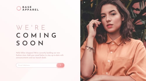
Base Apparel Coming Soon - SASS & HTML

Thomas Boittin• 265

@tboittin

Desktop design screenshot for the Base Apparel coming soon page coding challenge

This is a solution for...

  • HTML
  • CSS
  • JS
1newbie
View challenge

Design comparison


SolutionDesign

Solution retrospective


Hi, thanks for having a look at my work!

It's my 6th challenge on this website.

It took me 7h to complete.

  • Html structure - 30 min
  • Mobile version - 1h
  • Desktop version - 1h
  • Form validation - 1h30
  • Animation - 30min
  • Harmonization - 2h30

This one was surprisingly difficult.

Looking for information of HTML properties (here are oninvalid and setCustomValidity) proved to be a harder task than expected.

The instructions were a bit tricky about the gradients color, I'm still not sure if I did it correctly...

Also I finally figured out how to responsively set an absolute element !

This project is my 8th one of my 365 serie for 1 project per day :)

Feel free to share any way I can improve it, see you !

Community feedback

Sunny• 525

@statanasova

Posted

Hi Thomas. I agree, this one IS surprisingly difficult :) I like the way you tracked your time, I should really start doing this!

I noticed that your layout look perfectly on 375px mobile and 1440px desktops, but for resolutions between 375 and 1200px it sticks to the 375px layout. Is this on purpose? I believe layouts are expected to expand and shift as the resolution grows - tablet users, for example, would see a layout that is a bit different than the one for mobile users.

That being said, the result from your approach doesn't look too bad for this particular design :) Just keep in mind that clients usually expect to see fully fluid/responsive implementations - with the layout shifting at least once or twice between mobile and desktop.

About the form - an empty white popup appears when I enter an invalid email. You can prevent this behavior by adding an event.preventDefault(); when handling the form.

Finally :) The linear gradients look good to me. I see you use RGB values. Why not directly use the hsl values from the styleguide? :) It will save you the time to convert them, plus HSL colors nowadays are considered the better option for larger scale projects. Here is a bit info on that, if you're interested.

Good luck with your 365 days of 1 project per day. Seems like a great challenge, you will learn so much!

PS. Upvote if you found any of this helpful :)

2

Thomas Boittin• 265

@tboittin

Posted

@statanasova Hi Sunny, thanks for the reply :)

I usually do some in-between design but couldn't figure a quick pattern that would look good for this one. In the end, I just kept the mobile design using max-width to prevent containers to go out of control :)

Thanks for the prevent.default() tips, I usually do that with project using event trigger in React.js, didn't thought about it in this html project. Will give it a try. To prevent the built-in tooltip I used this.setCustomValidity(' ') which replace the text of the toolbox with a space. I'm using Google Chrome by the way. I first tried to replace with nothing between quotes but it didn't override the default message so I tried with a space and it worked out. I didn't try this with other browsers, the behavior might be different and that would explain why you're getting this weird popup.

Finally, I indeed use the hsl values but since I'm using sass, my stylesheet gets preprocessed into usual css. It seems sass turns hsl values into rgb for some reason.

Happy New Year !

1

@JesusAtao96

Posted

Hello Thomas Boittin 👋

Nice job on this challenge, I would add more padding and a transparent background to the input.

Happy New Year and keep coding 😊.

2

Thomas Boittin• 265

@tboittin

Posted

@JesusAtao96 Hi Jesus,

Thanks for your comment, will do asap.

Happy new year to you too !

0
Sunny• 525

@statanasova

Posted

You've given the project quite a lot of though, that's great :)

Honestly, I don't know why frontend devs are expected to come up with tablet layouts. But that's how it is in real-life projects as well - you get a mobile and a desktop layout and you scale them... somehow :) It can become a huuuge time waster indeed.

Practice makes perfect, I guess...

Popup - yes, I'm using Firefox, probably why I was seeing the empty popup. But I think the preventDefault() works, because I don't see it anymore :)

Colors - oh wow, I also use sass, but I prefer css variables for my colors and had no idea sass converts HSLs to RGBs. That's very interesting, thanks!

Bye for now!

1

Please log in to post a comment

Log in with GitHub
Discord logo

Join our Discord community

Join thousands of Frontend Mentor community members taking the challenges, sharing resources, helping each other, and chatting about all things front-end!

Join our Discord