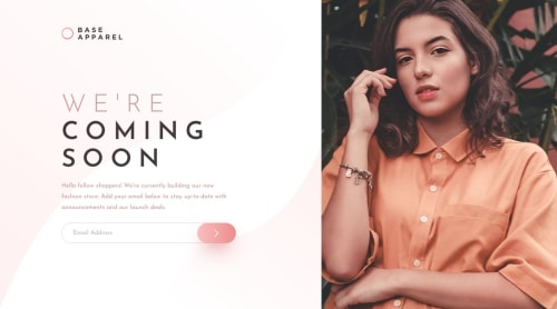
Skip to content
  • Unlock Pro
  • Log in with GitHub
Solution
Submitted almost 2 years ago

BASE APPAREL (FLEXBOX + JAVASCRIPT)

SooperChiller•60
@SoopChiller
A solution to the Base Apparel coming soon page challenge
View live sitePreview (opens in new tab)View codeCode (opens in new tab)

Solution retrospective


Hello fellow coders! I'm Joshua and this is my solution for this challenge.

In Summary I used:

  • Flexbox
  • JavaScript

I'm still quite new to frontend development and try to be aware of best practices.

  • What can I do to improve my HTML/ is it semantic enough?

  • Is my approach with the JS an appropriate one?

ALL FEEDBACK WELCOMED! THANKS FOR READING

HAPPY CODING!

Code
Select a file

Please log in to post a comment

Log in with GitHub

Community feedback

  • Aditya Yadav•710
    @mraditya1999
    Posted almost 2 years ago

    for simpler solution to make it responsive and elegant design you can follow these steps:

    /* CSS code for the container and the two divs */
    .container {
      display: flex;
    }
    
    .left-section, .right-section {
      width: 50%;
      height: 100%;
    }
    
    .right-section {
      background-image: url("path/to/your/image.jpg"); /* Set background image for the right section */
      background-size: cover; /* Adjust the background image size to cover the container */
      background-position: center; /* Center the background image within the container */
    }
    
    /* Media query for screen sizes below 800px */
    @media (max-width: 800px) {
      .container {
        flex-direction: column; /* Display the divs vertically on smaller screens */
      }
    
      .left-section, .right-section {
        width: 100%; /* Make the divs occupy full width on smaller screens */
      }
    }
    

    With this CSS code, we create a container with flex display and two divs inside it, .left-section and .right-section. Both divs will have a width of 50% each, occupying half of the container's width. The .right-section will have the specified background image, which will cover the container and remain centered within it.

    For smaller screens below 800px, we use a media query to change the flex-direction to column, making the divs stack vertically. We also set both divs to occupy the full width, eliminating the repeating background image and ensuring a clean and professional design.

    Marked as helpful

Join our Discord community

Join thousands of Frontend Mentor community members taking the challenges, sharing resources, helping each other, and chatting about all things front-end!

Join our Discord
Frontend Mentor logo

Stay up to datewith new challenges, featured solutions, selected articles, and our latest news

Frontend Mentor

  • Unlock Pro
  • Contact us
  • FAQs
  • Become a partner

Explore

  • Learning paths
  • Challenges
  • Solutions
  • Articles

Community

  • Discord
  • Guidelines

For companies

  • Hire developers
  • Train developers
© Frontend Mentor 2019 - 2025
  • Terms
  • Cookie Policy
  • Privacy Policy
  • License

Oops! 😬

You need to be logged in before you can do that.

Log in with GitHub

Oops! 😬

You need to be logged in before you can do that.

Log in with GitHub

How does the accessibility report work?

When a solution is submitted, we use axe-core to run an automated audit of your code.

This picks out common accessibility issues like not using semantic HTML and not having proper heading hierarchies, among others.

This automated audit is fairly surface level, so we encourage to you review the project and code in more detail with accessibility best practices in mind.

How does the CSS report work?

When a solution is submitted, we use stylelint to run an automated check on the CSS code.

We've added some of our own linting rules based on recommended best practices. These rules are prefixed with frontend-mentor/ which you'll see at the top of each issue in the report.

The report will audit all CSS, SCSS and Less files in your repository.

How does the HTML validation report work?

When a solution is submitted, we use html-validate to run an automated check on the HTML code.

The report picks out common HTML issues such as not using headings within section elements and incorrect nesting of elements, among others.

Note that the report can pick up “invalid” attributes, which some frameworks automatically add to the HTML. These attributes are crucial for how the frameworks function, although they’re technically not valid HTML. As such, some projects can show up with many HTML validation errors, which are benign and are a necessary part of the framework.

How does the JavaScript validation report work?

When a solution is submitted, we use eslint to run an automated check on the JavaScript code.

The report picks out common JavaScript issues such as not using semicolons and using var instead of let or const, among others.

The report will audit all JS and JSX files in your repository. We currently do not support Typescript or other frontend frameworks.

Oops! 😬

You need to be logged in before you can do that.

Log in with GitHub