


@MarlonPassos-git
Posted
Hello darry, good job. Her design was good, very flexible for all screen sizes. Now some of my suggestions for you to improve the project
- I would add a
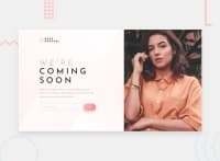
background-position: top;to the girl's image because in some screen sizes her face is cut off, see https://prnt.sc/1tgybpj
-I would put a larger left margin to look more like the original version
-
Add a more interesting hover effect to the button and input
-
In case of pages that fit on the user's screen without scrolling, I recommend putting your reference "Challenge by Frontend Mentor. Coded by @darryncodes." using a fixed placement as this prevents this from happening: https://prntscr.com/1tgz231
-
When you are going to put some content in the html that on loading the page is not to be displayed, put this content inside a <template> tag. In this case I mean the <p class="success"> and <p class="error">
-
The image in the desktop version does not occupy 50% of the screen but a little less (42.361% to be more exact), that the subtlety in the visual that also helps to leave more space for the text (but this is the least significant point)
Marked as helpful
@darryncodes
Posted
Hi @MarlonPassos-git thanks for taking the time to feedback, much appreciated.
I've updated my design accordingly, here are some responses:
- bg position top added
- left margin added, good call
- box-shodow added on hover of the submit btn
- i'm okay with the position of the attribution footer, very valid feedback and would definitely help
- I didn't know about the
<template>tag, really interesting - i'll be mindful of this next time - updated the hero mage to account for 60/60 split, i didn't seem to notice the subtlety in the design - good spot

