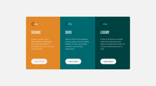
Basic CSS with media queries and flexbox

Solution retrospective
I would appreciate any suggestions you might have.
Please log in to post a comment
Log in with GitHubCommunity feedback
- @gmqrk247
Hey!
Great work! One little hint, if you put a transparent border on the button on it's normal state, you can avoid the growing and shrinking with the hover effect. just like this:
.btn{border:2px solid transparent}Marked as helpful - @UrbanskiDev
Hello Atul kumar !
Congratulation for finishing this project
- In your html file, I recommend you to modify your
<div class="container">by a<section>, a div tag has no meaning in html while section does have one !
I give you a link about section tag, and html semantics in general to learn more about it :
- In your css file, you can define variable to make it easier to maintain, like color definition :
:root{
--var-name:hsl(31, 77%, 52%);
}

.card1{
background-color:var(--var-name);
}
I give a link to learn more about them :
I hope it helps you, keep learning and happy coding !
Marked as helpful - In your html file, I recommend you to modify your
- @correlucas
👾Hello Atul kumar, congratulations for your first solution!👋 Welcome to the Frontend Mentor Coding Community!
Your solution seems fine, you did a really good job wrapping the content for these 3 cards. Something you can improve here is to use a
single classto manage the content that is mostly the same for the 3 cards (paddings, colors, margins and etc) and another class to manage the characteristics that are different (colors and icon), this way you'll have more control over then and if you need to change something you modify only one class. Add a margin of aroundmargin: 20pxto avoid the card touching the screen edges while it scales down.✌️ I hope this helps you and happy coding!


Join our Discord community
Join thousands of Frontend Mentor community members taking the challenges, sharing resources, helping each other, and chatting about all things front-end!
Join our Discord