Basic HTML and CSS 3

Solution retrospective
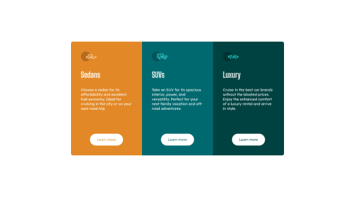
Hello! The desktop version looks amazing. I dare to say it looks exactly the same as the preview, but I can not say the same with the mobile version... Can someone help me to make this responsive and looking good on mobile version? I know about the mediaqueries and all that, but for some reason I can not make it work. I would appreciate some guiding here, thanks!
*Things needed on mobile version: Change the border-radius and the width of the boxes.
Please log in to post a comment
Log in with GitHubCommunity feedback
- @Babajide777
Hi Oscarandio,
I advise you use CSS Grid to make it more responsive. CSS grid made build the project a lot easier. You can check my solution here: https://www.frontendmentor.io/solutions/semantic-html5-markup-css3-flexbox-grid-fZ4rIBPVH
- @AgataLiberska
Hi Oscar!
In general, it's a lot easier to just start with the mobile design, since divs just stack on top of each other in a column, just like you want them to be here. So what I would do is add a media query with a min-width and only apply
display: flexto the .container class on viewports wider than, say, 900px or so? You'll probably want to set a max-width on mobile and unset or change it on desktop.Another thing is - I would set min-height on the body element, and set it's display to flex to center the container inside the body :)
What is tripping you up right now as well is the padding you've got set on the body - that's what is causing the last card to be below the other two on the preview above.
And to sort the border-radius on the cards - you can set that on the container as well, just make sure to add
overflow:hiddenso that the corners of individual cards don't cover the rounded container corners.Hope this helps, let me know if you have any questions!


Join our Discord community
Join thousands of Frontend Mentor community members taking the challenges, sharing resources, helping each other, and chatting about all things front-end!
Join our Discord