Skip to content
  • Unlock Pro
  • Log in with GitHub
Solution
Submitted about 1 year ago

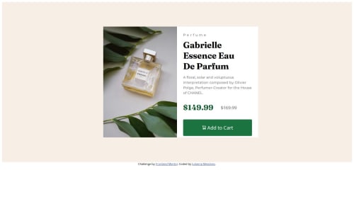
Basic Product Card with CSS Grid

Julianna Messineo•290
@mathematiCode
A solution to the Product preview card component challenge
View live sitePreview (opens in new tab)View codeCode (opens in new tab)

Solution retrospective


What are you most proud of, and what would you do differently next time?

This was my first responsive web page so I'm proud of getting it to look pretty close to the design. Next time, I want to more thoughtfully plan out the html to make sure my CSS code is efficient. For example, I think there were some places where using a class would have been more efficient than creating CSS for each element by their ID. Also some of my solutions were kind of hacky and I relied on using px as a unit so I'd like to learn how to use the other units of measurement in CSS to make the page more responsive.

What challenges did you encounter, and how did you overcome them?

I could not figure out how to get the picture and the information to be centered with no space in between with either CSS grid or flexbox whilst having them have the same width and height. I figured it out by setting each part to a specific number of pixels but I'm sure there's a more flexible way to do it.

Another challenge was when I made the screen mobile sized, the elements were not remaining centered. I used some media queries to fix that.

What specific areas of your project would you like help with?

I am super beginner at this stuff. I would love suggestions on how to make this simpler and more efficient. I'm interested in the best way to get the picture and info box centered and remaining the same size in a responsive way, maybe not using pixels as units.

Code
Select a file

Please log in to post a comment

Log in with GitHub

Community feedback

  • Rahul Kumar•570
    @rahulkumar215
    Posted about 1 year ago

    Hello @mathematiCode👋

    Congratulations on successfully completing the challenge! 🎉

    I have a suggestion regarding your code that I believe will be of great interest to you.

    • You got the not using px part right. Using px is not a good idea to make a website, you can use them for smaller parts of the website, such as for border-radius and others. I would recommend learning about rem, em, vw, and vh also using % etc.

    • Learn When To Use CSS Units

    • You are gonna love this

    I hope you find this helpful 😄 Above all, the solution you submitted is great !

    If you need any feedback or suggestions, I am happy to help

    Have Fun Coding!

    Marked as helpful

Join our Discord community

Join thousands of Frontend Mentor community members taking the challenges, sharing resources, helping each other, and chatting about all things front-end!

Join our Discord
Frontend Mentor logo

Stay up to datewith new challenges, featured solutions, selected articles, and our latest news

Frontend Mentor

  • Unlock Pro
  • Contact us
  • FAQs
  • Become a partner

Explore

  • Learning paths
  • Challenges
  • Solutions
  • Articles

Community

  • Discord
  • Guidelines

For companies

  • Hire developers
  • Train developers
© Frontend Mentor 2019 - 2025
  • Terms
  • Cookie Policy
  • Privacy Policy
  • License

Oops! 😬

You need to be logged in before you can do that.

Log in with GitHub

Oops! 😬

You need to be logged in before you can do that.

Log in with GitHub

How does the accessibility report work?

When a solution is submitted, we use axe-core to run an automated audit of your code.

This picks out common accessibility issues like not using semantic HTML and not having proper heading hierarchies, among others.

This automated audit is fairly surface level, so we encourage to you review the project and code in more detail with accessibility best practices in mind.

How does the CSS report work?

When a solution is submitted, we use stylelint to run an automated check on the CSS code.

We've added some of our own linting rules based on recommended best practices. These rules are prefixed with frontend-mentor/ which you'll see at the top of each issue in the report.

The report will audit all CSS, SCSS and Less files in your repository.

How does the HTML validation report work?

When a solution is submitted, we use html-validate to run an automated check on the HTML code.

The report picks out common HTML issues such as not using headings within section elements and incorrect nesting of elements, among others.

Note that the report can pick up “invalid” attributes, which some frameworks automatically add to the HTML. These attributes are crucial for how the frameworks function, although they’re technically not valid HTML. As such, some projects can show up with many HTML validation errors, which are benign and are a necessary part of the framework.

How does the JavaScript validation report work?

When a solution is submitted, we use eslint to run an automated check on the JavaScript code.

The report picks out common JavaScript issues such as not using semicolons and using var instead of let or const, among others.

The report will audit all JS and JSX files in your repository. We currently do not support Typescript or other frontend frameworks.

Oops! 😬

You need to be logged in before you can do that.

Log in with GitHub