Basic solution

Solution retrospective
I've been able to use more semantic HTML and flex to do centering and adaptive stuff. I was able to approach the challenge with the mindset that the page might be dynamic, so description can be longer or shorter and it shouldn't break the page.
Adjusting fonts and margins by eye was annoying (I use jpg version of design file) so I wasn't pixel hunting too much.
I think class names could be better and also I could use more general classes that would combine some similar elements.
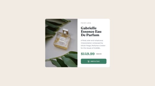
What challenges did you encounter, and how did you overcome them?I've had trouble with vertically aligning text, some finessing was done. Also I've noticed that the picture in design file is a bit darker and more contrasty, I've decided not too fiddle with this too much, since I assume this is outside of normal CSS work.
Please log in to post a comment
Log in with GitHubCommunity feedback
No feedback yet. Be the first to give feedback on fox22432's solution.
Join our Discord community
Join thousands of Frontend Mentor community members taking the challenges, sharing resources, helping each other, and chatting about all things front-end!
Join our Discord