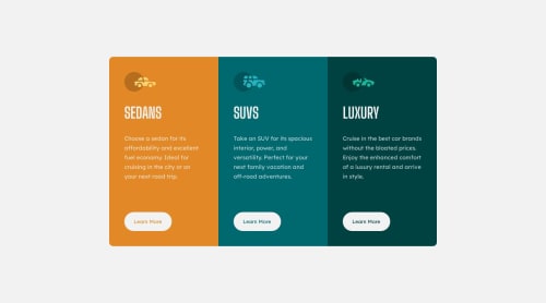
Basic solution using HTML and CSS

Solution retrospective
The main difficulty I faced while took on this challenge, is the responsivity. That was the part that got me stuck for a while to find out. Some things I wanted to question for a possible feedback:
-
What "max-width" values do I specifically use while working with responsivity screens? I know there are specific values for it, but I think sometimes those values aren't exactly accurate as I tried to implement in this challenge.
-
In a overall question, what practices I could do to improve my responsivity knowledge and try to improve on? This is the part that gets me everytime while working in a front-end page, so it's kinda difficult for me, as a "intermediate-beginner" student.
Please log in to post a comment
Log in with GitHubCommunity feedback
- @Freedteck
Hey! Kudos on making the design responsive without libraries. Concerning your questions, since you're using flexbox layout, specifying the height for each card class can be strategic. Instead, use the gap: value; property to specify space between elements in the layout and use padding top and bottom to make the container long.
As for the max-width, it's useful when dealing with responsiveness. My suggestion to your code is to wrap all the card class in a div element, then in your css, give the div element a max-width value. Play around the value till you are convenient.
- P@adonmez04
Hi, @vitor200450.
That's a good solution. Keep coding. Here are some important tips.
-
An element should take width and height values from its own content. This is the subject of the box model, and it's the most important topic in CSS. Before you focus on responsive design, make sure you understand this topic deeply.
-
In general, content is a text and it has its own width and height value depending on its font-family, font-size, font-weight, line-height, and so on. That's why there are so many font style properties.
-
And its padding and border values add to its content value, such as font styles. That's why we use the
box-sizing: border-boxdeclaration. -
And the margin is related to the element, but doesn't add value to the element's content. It adds value to the content of the element's parent.
-
With this nesting feature in HTML, any elements can be parent or child inside each other. And they can take their width and height values from their child or parent lol.
-
I know this is hard to understand at first, but step by step it will make sense. To learn this, you can practice a little on Figma.
I highly recommend this site to learn this method. You can try to convert some small components and check their width and height values (like
where do the values for the width and height of the element come from?etc.). You don't need to focus on responsive design immediately. It's free and has figma files. https://uidesigndaily.com/.And you can use this little extension to check that your solution has true values: https://chrome.google.com/webstore/detail/perfectpixel-by-welldonec/dkaagdgjmgdmbnecmcefdhjekcoceebi
Don't worry, it's just a small step, you'll be fine.
I hope these will help you. Keep coding and have a wonderful day.
-


Join our Discord community
Join thousands of Frontend Mentor community members taking the challenges, sharing resources, helping each other, and chatting about all things front-end!
Join our Discord