Submitted over 4 years agoA solution to the Social proof section challenge
Beginner: Social proof section

@NJain0001
Solution retrospective
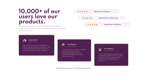
One of the things that I struggled with was the star section on the desktop version. It feels like the stars and the message aren't lined up properly, and the code around that piece felt "hacky". I was using positioning and display inline-block which felt wrong. If there is a better way, can you point me in the right direction?
Code
Loading...
Please log in to post a comment
Log in with GitHubCommunity feedback
No feedback yet. Be the first to give feedback on Nishant Jain's solution.
Join our Discord community
Join thousands of Frontend Mentor community members taking the challenges, sharing resources, helping each other, and chatting about all things front-end!
Join our Discord