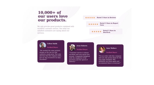
Not Found
Not Found
Not Found
Not Found
Not Found
Not Found
Not Found
Not Found
Not Found
Not Found
Not Found
Not Found
Not Found
Not Found
Not Found
Not Found
Not Found
Not Found
Not Found
Not Found

Submitted

BEM + Grid Template Areas to make responsive design a cake walk

#accessibility#bem

@vikramvi

Desktop design screenshot for the Social proof section coding challenge

This is a solution for...

  • HTML
  • CSS
1newbie
View challenge

Design comparison


SolutionDesign

Solution retrospective


  • I was scared of CSS to death last year, later somehow managed to learn it and bring design to life with loads of trial and error ( just like ~ 1.25 million Indian railway employees try super hard to keep slow moving trains on track and make sure it reaches destination with 1 - 4 hours of scheduled time. I'm an Indian who stayed in Germany for many years and seen how things should be run efficiently )
  • Then I found the magic of "BEM" and "Grid Template Areas"
  • This is 1st project where I've used "Grid Template Areas"
  • I'll highly recommend to use above technique and see the difference with your other ways of styling.
  • Usage of Grid template area is like playing Jigsaw Puzzle Game where you first cut design into appropriate pieces and then place pieces in place with template area names.
  • With BEM I could play around spacing without worrying about breaking things randomly, in fact I can confidently say BEM is life saver
  • I did struggle with placement, spacing etc as it was my 1st project but this technique makes me think differently than flexbox styling, I can avoid position totally and do much lesser padding, margin etc as well

please review code and let me know areas of improvement.

Community feedback

P
Grace 27,870

@grace-snow

Posted

Hi

I recommend improving the html on this. There are a few foundational issues with this

  1. All those star images need to have empty alt values. These are decorative and there is already writing to communicate the 5 star ratings. Additionally, it is very frustrating for screenreader users when the same alt text is read out again and again
  2. Similarly, these should not be wrapped in figure elements. There is no point using figure at all unless you need two lots of content and one of them is a figcaption
  3. Alt text descriptions shouldn’t ever include words like “image” or “picture. The tag is already an image. If it’s an image of a named person, their name alone is fine as alt text
  4. Headings must go in order, never skipping levels and only be used for appropriate content. Eg verified purchaser is not appropriate as a heading, it’s just a paragraph
  5. Optional, this one. Consider using a blockquote for the testimonials
  6. I’m not sure you understand fully how to use sections. They act just like divs most of the time (unless labelled basically), so there is no need to use so many. Think of them as always needing a h2 heading. If you wanted to use section to wrap the 3 testimonial boxes as well as the individual boxes, really it should have an sr-only h2 like “testimonials” and then each box could keep its h3 as they belong to the section above. All this section stuff is not actually problem - like I said they are acting exactly as divs atm - it is more to advise that it is fine to use divs for layout you don’t have to use section for everything

One other tiny thing. Well done on use of BEM. I’m glad you’re finding it helpful. Note you are not using it fully though. You can do modifiers like card 1 2 etc with a double hyphen. So use of a modifier class would be something like button button--secondary

Marked as helpful

4

@vikramvi

Posted

@grace-snow Thanks a ton for valuable inputs.

  1. Can you please recommend any resource to improve HTML wrt SEO and Accessibility ?

  2. Can you please point me to any of your projects from FM where I can refer to more learning wrt these review comments ?

Thanks again for your time, I will fix these and resubmit.

Regards, Vikram

0
P
Grace 27,870

@grace-snow

Posted

@vikramvi you never need to resubmit. You can push up new code to the repo whenever you like

1

@vikramvi

Posted

@grace-snow can you please share some sample repos which I can refer to; for improving HTML and CSS code quality ?

0

@vikramvi

Posted

adding references from slack communication for benefit of others

  1. https://moderncss.dev/topics/
  2. https://every-layout.dev/rudiments/boxes/
  3. https://www.htmhell.dev/
  4. https://adrianroselli.com/tag/accessibility
  5. https://jensimmons.com/
  6. https://rachelandrew.co.uk/css/
  7. https://www.sarasoueidan.com/blog/
0

@EngineerHamziey

Posted

@vikramvi

Hello Vikram Ingleshwar, Here is a way you can learn more from people like @grace-snow, @vanzasetia and other bosses around here

  • Go to their profile and go to their solutions read the comments on it visit their code on GitHub and read through.

  • Go to their profile visit their comments, and read their comments on other people's code. Trust me, you will learn alot from that 😊.

  • Also anytime you finish a project ask questions and also read other people's code of the same project. It will help alot.

  • Always experiment what people recommend as correction, change values around, read the write up/ blog post they recommend on a particular topic.

I hope this was helpful ☺️

3

@vikramvi

Posted

@EngineerHamziey Thanks a ton for your valuable inputs, I will follow these as well.

1

Please log in to post a comment

Log in with GitHub
Discord logo

Join our Discord community

Join thousands of Frontend Mentor community members taking the challenges, sharing resources, helping each other, and chatting about all things front-end!

Join our Discord