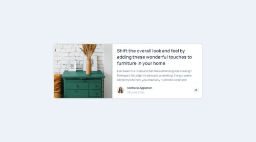
BEM methodology, DOM manipulation

Solution retrospective
I’m proud of the logic that use to manipulate the DOM.
What challenges did you encounter, and how did you overcome them?Something a bit tricky for me was how to put in one function the logic to the mobile, tablet and desktop size, since it works slightly different in the mobile size, i overcome this using a conditional that makes a validation when the component change to a specific width, and then the logic for the social media icons changes.
What specific areas of your project would you like help with?My component works ok, but i notice that it has an issue that i didn’t resolve. It happens when the screen size has a width of 660px and it shows the social media icons when the user clicks the share icon, until that moment everything is ok, the problem is when the user goes back to the mobile size and click the share icon again, this causes that the logic for tablets and desktop applies to the mobile size and it breaks the layout in that area.
Please log in to post a comment
Log in with GitHubCommunity feedback
No feedback yet. Be the first to give feedback on Santiago's solution.
Join our Discord community
Join thousands of Frontend Mentor community members taking the challenges, sharing resources, helping each other, and chatting about all things front-end!
Join our Discord