
Solution retrospective
What are you most proud of, and what would you do differently next time?
I learned how to use rem a lot in this case and more about padding and margins. In my previous example, I used a lot of px when I think rem is better for consistency.
What challenges did you encounter, and how did you overcome them?I struggled with alignment and padding, but I overcame them by trying and trying again.
What specific areas of your project would you like help with?I would like more help with media queries, since I built it first from a mobile design, but couldn't quite get the same look when I switched to desktop.
Code
Couldn’t fetch repository
Please log in to post a comment
Log in with GitHubCommunity feedback
- @Ali-Learner
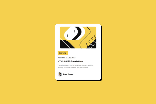
The design looks pretty good, but I think the image width should be set to 100% (relative to the parent element) to remove any sort of misalignment

Join our Discord community
Join thousands of Frontend Mentor community members taking the challenges, sharing resources, helping each other, and chatting about all things front-end!
Join our Discord