
Solution retrospective
I'm proud to have completed my second challenge. I'm also proud I pushed through and fixed some of the minor details when it came to the css, and I tried to keep the code as clean as possible.
I need to improve my HTML semantic. I did try to use better naming conventions this time, but there is room for improvement.
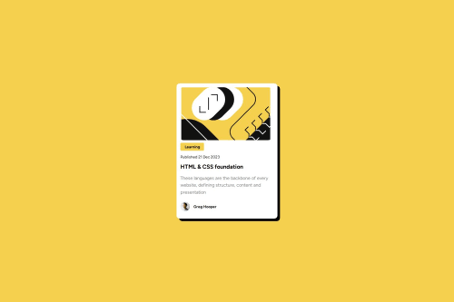
What challenges did you encounter, and how did you overcome them?I got stuck with aligning the author avatar with the text containing his name. I eventually used flex, and used other simple properties to make the text horizontally aligned with the image.
What specific areas of your project would you like help with?Semantic html, and tips on keeping cleaner css.
Please log in to post a comment
Log in with GitHubCommunity feedback
- P@SabineEmden
Hi there! 👋 Good job on completing the challenge.
Here are some suggestions how you can improve your solution. I hope this helps. Let me know if you have any questions!
Does the solution include semantic HTML?
Yes, the solution includes semantic HTML.
- I would use an
h2element for the heading instead of anh1. The blog preview card is a component. It would be used as part of a page. We want to have only oneh1heading per page. And this would probably not be on the preview card. There may even be several preview cards on the same page. - The three lines of text under the heading are one paragraph and should all be in the same
pelement. You can control the length of the lines and the line breaks through the width of the card and its padding. - The semantic element that missing in your solution is the
mainelement. It’s important for accessibility, and every page should have one.
Is it accessible, and what improvements could be made?
Yes, the solution is accessible to some degree. Font sizes are in
remand will adapt to the browser settings. But the design breaks because the container sizes won’t change with the font size.- The card only needs a
max-widthinrem. That would greatly improve the accessibility of your solution. As a general rule, never set a height on a container that contains text. Setting a max-width inremallows the container to grow if the user increases the font size in their browser settings. - The image should get its size from padding on the card and
max-width: 100%. - The content section of the card should get its size from the padding on the card and its content.
- The yellow box with the word learning should get its size from its content and its padding.
- The author image needs a width in
remorem, but no height. You can useaspect-ration: 1on the image.
Does the layout look good on a range of screen sizes?
Yes, the layout works on a rage of screen sizes. The card has a fixed width of 320 pixel. In the Figma design file, the width is 384 pixel on desktop.
- A better solution would be set the maximum width of the card to
24remand let the width of the card shrink on narrower screens. - I would also set padding on the
bodyelement to prevent the card from touching the edge of the screen.
Is the code well-structured, readable, and reusable?
Yes, the code is well-structured, readable and reusable, but the CSS code could be simplified.
- The content of the card doesn’t need to have a grid container. You can remove the
divand layout the card with normal flow. - The yellow box with the word learning also doesn’t need a grid container. A
pelement with padding is all you need. - You have some very complicated CSS selectors for the main paragraph under the heading. As I mentioned above, this needs to be a single
pelement. - There is no need to combine several class selector with descendant combinators. You can, for example, simply use
.card-authorinstead of.card .card-info .card-author. Look into BEM, if you want to use selectors that identify the hierarchy between.card,card-info, and.card-author.
Does the solution differ considerably from the design?
Yes, the solution differs considerable from the design. In the design, the heading is interactive. The brief for the challenge states users should be able to see hover and focus states for interactive elements on the page. There is also a design file that shows the active state.
- Wrap either the heading or the whole card in an
aelement. The blog preview card needs to have a link to the blog post its previewing.
Happy coding! 😎
- I would use an

Join our Discord community
Join thousands of Frontend Mentor community members taking the challenges, sharing resources, helping each other, and chatting about all things front-end!
Join our Discord