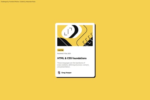
Blog card preview using CSS flexbox, @media and a variables

Solution retrospective
I feel like setting the main frame of the card as a flexbox, and utilising flex alignment settings along with padding makes it easy to add the various inner elemements with minimal CSS adjustments to them.
I also set up all the colours and the base paragraph font as variables. I then used calc() to adjust font across elements based on the base paragraph variable rather than using rem or %. I felt this approach makes it easier to adjust on a relative basis to the base paragraph.
What challenges did you encounter, and how did you overcome them?No major challenge. Variable fonts were new, so it was a learning experience to find out how to reference them in CSS.
What specific areas of your project would you like help with?I was wondering about good practices on images within containers.
In this exercise I kept default content box settings and I use a width and padding on the container. It was then easy to specify the same width for the image element.
But from a responsiveness point of view, is this the best way to approach images. Specifying width in px of image and container, or is there a better way to do this. For example I remember there is object-fit which can crop an image to fit a container, would this have been better?
Please log in to post a comment
Log in with GitHubCommunity feedback
No feedback yet. Be the first to give feedback on Alexander Roan’s solution.
Join our Discord community
Join thousands of Frontend Mentor community members taking the challenges, sharing resources, helping each other, and chatting about all things front-end!
Join our Discord