@FaysalFarouk
Latest solutions
'Meet landing page' with adaptation to tourism theme 'DaNang' page
PSubmitted 8 months agoA couple of questions:
- What approach did others take to have the hero image crop of screen
- What approach did others take to vertical spacing, did anyone else try to fit the sections into 'vertical space' or just rely on padding etc. between elements.
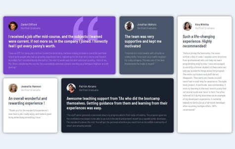
Testimonial grid with alternative 'Yamanote Line' design
PSubmitted 8 months agoNothing in particular, but always open to feedback on my design or anything you think in my CSS is not optimal.
Four card feature with bonus Pokemon version - Gotta Catch 'em all!
PSubmitted 8 months agoNothing for now.
Product preview card: mobile first, responsive units
PSubmitted 8 months agoI'd be very interested in how others approached the width on this.
I'd also be interested on whether people tend to set all font's based on rem or whether in this design it makes sense to use em and have some fonts scale based on others.
Responsive recipe page with vanilla HTML & CSS (BEM naming)
PSubmitted 10 months agoFor some reason I couldn't seem to get the 'Outfit' font to apply to the ordered list markers. It seems to show up when inspecting, but the actual digits displayed look wrong.
Latest comments
- P@dearestalexander
Hello,
At just a quick glance:
- The desktop version doesn't show the left part of the image
- Your share menu pop-up for mobile needs to be adjusted to cover the bottom of the component. This was a key part of the challenge for me. Figuring out how to have a different style of pop-up for different screen sizes.
- Your desktop pop-up is missing the little pointer to the share button. Tip - you can rotate a square 45 deg. to get this effect.
It looks like a good first effort, would be nice to see it updated with the share menu working as per the desktop and mobile spec. Goodluck!
- @MenesesMGP@dearestalexander
Looks quite close Marcelo. You might want to give the hero text a minimum width I think it's wrapping and being narrow is throwing of you vertical spacing quite a bit. That's one change that may make it all line up better.
- @imrancodesP@dearestalexander
I like the way you did three different versions with an intermediate layout for devices like tablets.
- P@RetroApeWhat are you most proud of, and what would you do differently next time?
Used Grid for the first time. Awesome tool!
Made the transition with the help of Flexbox at a breakpoint, which made things much easier with the mobile layout.
There is nothing I would do differently at the current state of my skills.
What challenges did you encounter, and how did you overcome them?Using Grid.
Went through a couple of hours of research and there were no notable problems.
I had a small problem with positioning an icon on each Card, using
::after. The icon was refusing to touch the bottom of the border because the icon's "container" (orcontent) was bigger (higher) than it should have been.- Setting the height of the "container" to be the same height as the icon solved the problem
P@dearestalexanderLooks pretty good, nothing much to add. Nice job getting it so close by eye. I guess the shadow colour difference was an intentional choice.
I'm amazed how different out CSS is for the same exercise. Quite different approaches.
I think you said you used flex for mobile and grid for desktop. I used a mix of flex and grid for both. Grid for the cards, but flex on various objects to do things like position icons. It's very easy to switch grid between desktop and mobile just a couple of lines of CSS so might be worth trying that out as well to get more practice with grid. Unless you already know how.
- @techie084P@dearestalexander
Hi, just at a glance a few things seem different
- background color
- product name and price font
- letter spacing on 'perfume'
- spacing between different text elements h1, p etc.
- @TomSifWhat are you most proud of, and what would you do differently next time?
"For the first time, I started with a mobile-first approach and adjusted the breakpoints with media queries. It's probably my most advanced project so far, even though it's still simple. I spent way too much time fine-tuning some design details, such as the bullet points in the list, which needed to be centered in the paragraphs. There's probably a quicker method, but I eventually managed to adjust everything as expected. The project is fully responsive—probably a bit rough around the edges, but I'm still pretty proud of it!"
What challenges did you encounter, and how did you overcome them?"The darn bullet point that needed to be centered in the middle of the paragraph gave me a hard time. I had to use ::before with content: "\2022" and position: relative, then adjust the position of the last bullet with padding. And for some reason, it took me hours... At least now lists hold no more secrets for me—well, until proven otherwise!"
What specific areas of your project would you like help with?"I'd like to know the best way to implement margins so that they scale with the screen resolution. I had to use media queries at different resolutions, but the result feels a bit choppy. There must be a better way to do it."
P@dearestalexanderHi Thomas,
I'm not an expert, but a few comments:
- You may consider putting some comments in your html to explain your approach
- I'm not sure you need so many <div> and <sections>. When I look at <section> guidance, that generally applies to a larger peice of content. And you should only use when something more specific doesn't fit. I chose to put the whole recipe component into an <article> as it feels like an <article>, fits well with the examples in W3C guidance. Within that <article> I only felt I needed one styling <div> for the differently formatted 'preparation' section. All other content could be style partically with by using 'main'. And it's easy to space it all out with flex, padding and margins as needed.
CSS
- I recommend reading up on block element method , it's a good way to structure class names to make it easy to follow the logic of what is used where.
- For accessibility and re-usability it seems one good practice to get into the habbit of following is to apply specific styles mostly on classes. When you get to more complex designs avoiding styling on html tags mean there's less likely for specific adjustments to have unintended consequences. Of course I think base styling to body and main is normal, but styling on h1, p, ul etc. seems might be better to use classes.
- It's possible to make this responsive without using any @media queries at all. You can use width: min() and specific a size in ch for desktop and a size in & for mobile.
- I think you can re-work to reduce the number of CSS entries you have if you want to simplify.
Feel free to take a look at my solution to compare. I spent quite a bit of time trying to build it in line with feedback the community gave me on my previous solution. They gave a lot of good tips on responsiveness, readability, accessibility etc.
Marked as helpful