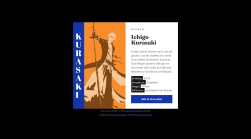
Product preview card: mobile first, responsive units

Solution retrospective
It's a fairly simple design, but there's a wide range of ways to approach it. I tried to keep it simple and responsive and I tried to minimise my CSS as much as possible.
I did this with CSS and flex. I'd probably be interested to try it again with grid and maybe bootstrap to see how different that would be.
What challenges did you encounter, and how did you overcome them?My focus on this exercise was figuring out the best responsive way to define widths. It seems for the mobile version on a small screen it's easy to set the component to 90% of the screen width (or body container etc.). However as the device size becomes wider and we transition to desktop the width needs to be controlled somehow. What's the best approach? I felt that rather than specifying widths on containers it's best to put a width on the widest content you want to control. This appears to be the product name and description. I ended up limiting the max-inline-size of those based on similar character (ch) counts as the spec images. This works and I found you can build a responsive design with flex and flex-wrap set to wrap. However I couldn't think of anyway to switch the images between desktop and mobile versions without a media query. So as I had to use a media query anyway I forced the flex direction switch inside it to ensure the image changes at exactly the same time as the alignment change.
This approach seems to work. But I realise that if you introduced a new product on the same card design with a lot more text the 31ch limitation could make the card's vertical size a lot longer. So I wonder about the best approach here? What is the optimal way to set width and allow the component to adjust depending on the content.
What specific areas of your project would you like help with?I'd be very interested in how others approached the width on this.
I'd also be interested on whether people tend to set all font's based on rem or whether in this design it makes sense to use em and have some fonts scale based on others.
Please log in to post a comment
Log in with GitHubCommunity feedback
No feedback yet. Be the first to give feedback on Alexander Roan’s solution.
Join our Discord community
Join thousands of Frontend Mentor community members taking the challenges, sharing resources, helping each other, and chatting about all things front-end!
Join our Discord