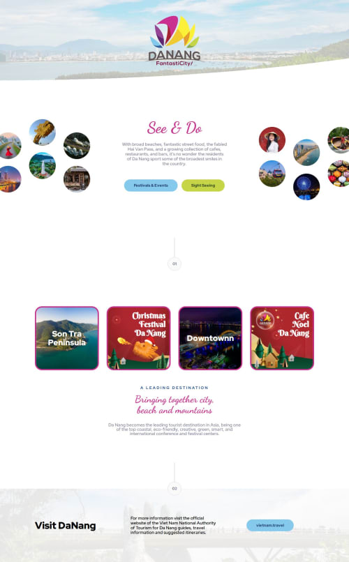
'Meet landing page' with adaptation to tourism theme 'DaNang' page

Solution retrospective
I did create two solutions:
I thought at first glance this challenge looked straightforward, but once I got into I realised there were a few tricky points relating to the use of grid and flex and the sizing and spacing.
Some of my approaches towards sizing and spacing may not be quite in line with the best solutions, but I did find building this to be good practice and I was able to experiment further with grid.
I also enjoyed creating my own variation on the design.
What challenges did you encounter, and how did you overcome them?I may have gone a bit off script vs. the specification, but I was playing around with trying to get the 'header + hero' to fill desktop vertical, and the second content section to do the same. This was a little but of practice on the concept of 'above the fold'. I am not 100% sure the design was meant to space like this one desktop. It's hard to tell in Figma. This does mean I have @media changing height and spacing to make it work on tablet and mobile.
What specific areas of your project would you like help with?A couple of questions:
- What approach did others take to have the hero image crop of screen
- What approach did others take to vertical spacing, did anyone else try to fit the sections into 'vertical space' or just rely on padding etc. between elements.
Please log in to post a comment
Log in with GitHubCommunity feedback
No feedback yet. Be the first to give feedback on Alexander Roan’s solution.
Join our Discord community
Join thousands of Frontend Mentor community members taking the challenges, sharing resources, helping each other, and chatting about all things front-end!
Join our Discord