Testimonial grid with alternative 'Yamanote Line' design

Solution retrospective
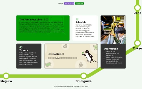
Note there is a link in the attribution at the bottom to switch between the yamanote design and the testimonial design.
Thanks to the really good grid training materials I didn't have too many problems with this exercise. In addition to grid for the macro layout I found grid useful to align the small headshot images with the name and role text.
In general I find grid is a little more predictable than flex for quick use and is more concise from a CSS point of view. So I can imagine I will use it more.
For my alternate design I had a bit of fun making the background image in figma. Starting to think about background images was a nice process from a design standpoint for me and I think there's a lot of fun to be had here, although I appreciate they are just decorative and not very functional.
What challenges did you encounter, and how did you overcome them?Nothing major, I learnt during this exercise you can't easily change opacity of background images so you need to either adjust your .svg or use some tricks.
What specific areas of your project would you like help with?Nothing in particular, but always open to feedback on my design or anything you think in my CSS is not optimal.
Please log in to post a comment
Log in with GitHubCommunity feedback
No feedback yet. Be the first to give feedback on Alexander Roan’s solution.
Join our Discord community
Join thousands of Frontend Mentor community members taking the challenges, sharing resources, helping each other, and chatting about all things front-end!
Join our Discord