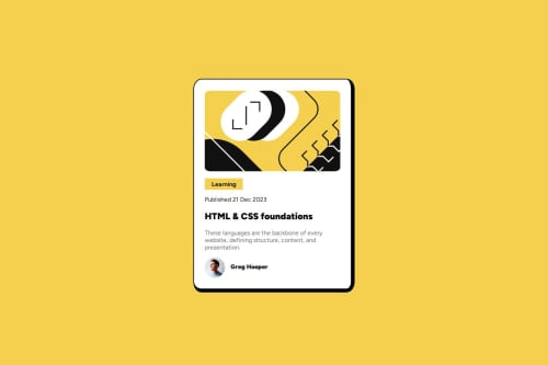
Blog Card Preview using HTML and CSS

Solution retrospective
Proud of making the design as similar as possible
What challenges did you encounter, and how did you overcome them?CSS optimization is the main challenge I encounter and I am not able to solve it
What specific areas of your project would you like help with?CSS optimization is the main challenge I encounter
Please log in to post a comment
Log in with GitHubCommunity feedback
- P@SimonCassan
Hello, You’ve done a great job overall! I do have a few suggestions for improvement:
HTML Enhance your semantic markup by adding <main> and <footer> elements where appropriate. Always include an <h1> element and ensure you don’t skip heading levels. Avoid using HTML elements like <strong> purely for styling; instead, use CSS for visual presentation.
CSS Consider using rem for padding and margin values—it’s generally a better practice for scalability. Adding a fixed width or max-width to your <img> elements would improve the layout on very large screens. You might want to add align-items: center; to your .profile class for better alignment. The layout is not fully responsive for mobile. Replace width: 25% on the card with a max-width to improve its adaptability on smaller screens.
Keep up the great work! 😊
Marked as helpful

Join our Discord community
Join thousands of Frontend Mentor community members taking the challenges, sharing resources, helping each other, and chatting about all things front-end!
Join our Discord