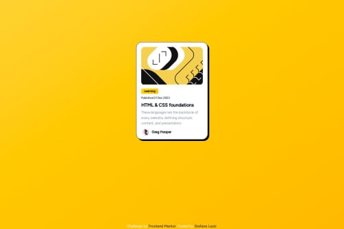
Blog Card Preview with react, tailwind css and some custom css

Solution retrospective
One of the additional challenge said to make the text change size without the use of media queries, i found that i could use in the body selector
body{font-size:calc(0.75em + 1vmin);}
But using tailwind default classes i actually didn't see any difference, i guess i would have to custom change them or make my own to make it work but if someone can give me some tips on this i would be grateful! 😁
Please log in to post a comment
Log in with GitHubCommunity feedback
- P@devmd1997
Good use of using react and separating out each component. The layout for the content seems to change depending on the screen size. I often run into this problem sometimes too. To fix that I use a top down approach when building the layout for individual components. Focus on building the parent component's layout then the child components will conform to the parent's rules. I would also suggest using Tailwind custom styles in your future approaches as it makes organizing your styles easier and easier to debug if something unexpected happens.

Join our Discord community
Join thousands of Frontend Mentor community members taking the challenges, sharing resources, helping each other, and chatting about all things front-end!
Join our Discord